

Which report answers which question
A map from the question you are asking — how busy the rooms are, who never turns up, which department books the most — to the one analytics page that answers it, with what each page filters by and what it exports.
Ten pages in the Booking menu look like “the report”, and none of them is. Each answers a different question, so start from the question and open the one page built for it. Dashboard is the front door; the rest sit under Analytics and Logs, except Email report, which lives under Settings.
Open Dashboard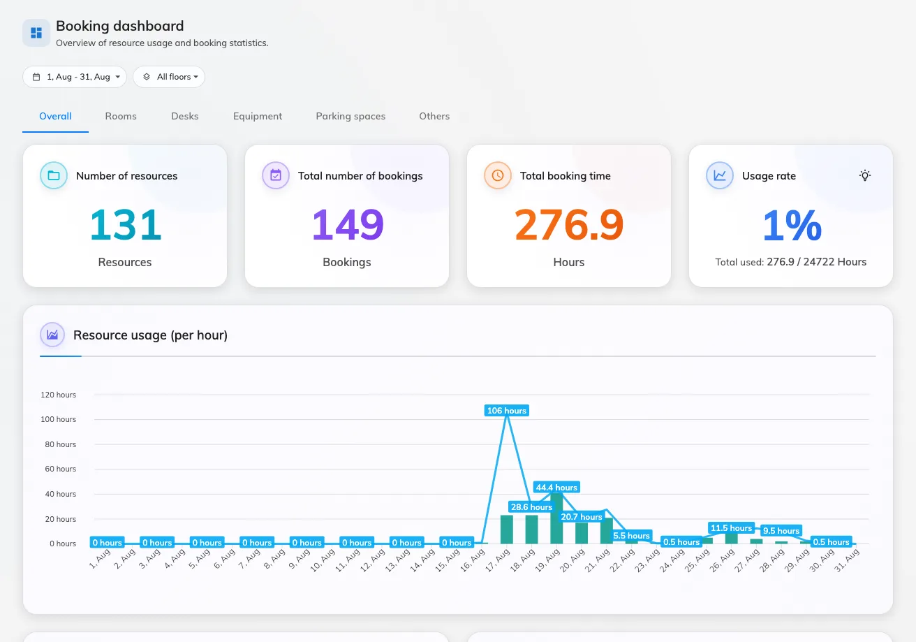
Dashboard — four numbers, then the charts.
| The question you have | Open | What it gives you |
|---|---|---|
| How is the estate doing right now, on one screen? | Dashboard | Four numbers — resources, bookings, booked time, usage rate — and four charts. Date range, floors, resource-type tabs. No export. |
| Which floor or room should we add or retire? | Resource usage analytics | A floor-plan heat view, a usage trend, resource ranking, top users and peak hours. Each ranking card has its own Export to Excel. |
| I need every room’s usage for last quarter. | Resource usage analytics › Resource ranking › Export | Period Last quarter, Rooms tab: one row per room — bookings, hours and usage rate — every room, including the unbooked ones. |
| Who books rooms and never turns up? | No show analytics | No-show rate, user and resource no-show rankings, and an events log. Export to Excel per card. |
| How much does each department or person use? | User resource usage | A pivot you build yourself — any two dimensions as Rows and Columns, bookings and hours as the numbers. Download as Excel. |
| I want to slice the same bookings every which way. | Booking analytics | Seven views of one dataset: timeline, snapshot map, usage map, daily heatmap and three tables. Its filter narrows all seven. The tables Export to Excel. |
| When is this room busy, hour by hour? | Booking analytics | Filter to one room, then read the Daily heatmap — hours down the side, dates across the top. The only page that will narrow a heatmap to a single resource. |
| I need a deck for management. | Reports | Nine named rates, each a page. Download full report saves them all as one PDF. |
| I have a one-off question. | Swift Insight | Ask in plain words — “which floor has the most bookings?” — and read the answer. No filters, no export. |
| Send me the numbers, I will not log in. | Email report | Not a viewer: a subscription that emails a summary of past bookings weekly, fortnightly, monthly or quarterly, or a forecast of the ones coming up. |
| I just want the bookings themselves, as a spreadsheet. | Management calendar › Export | Not an analytic: the bookings on screen, a column per field you pick, as XLSX, XLS or CSV. Bounded by the rows the file would hold, not by the period. |
| Who cancelled that meeting? | Booking log | Every action on every booking, with who did it and from where. Download as Excel. |
| Why has this person run out of quota? | Quota usage history | One row per deduction — who, which booking, how much. Download as Excel. |
Visiting, Ticketing and Service each have a Dashboard of the same shape at the top of their own menu — numbers, then charts — and, like this one, none of them exports. The visitor side has a report map of its own.
How the filters differ
A date range is on every page except Swift Insight, and it is the first thing to check when a number looks wrong. Where the pages differ is the second filter. Most booking pages filter by Floors; the Visiting dashboard filters by Buildings, because a visitor belongs to a building rather than a floor. Dashboard, Resource usage analytics and No show analytics add a resource-type strip — Overall, Rooms, Desks, Equipment and so on.
Resource usage analytics is the exception worth knowing. Its floor picker is a control over the map rather than a filter on the page: the ranking, the trend, the top users and the peak hours underneath it are the whole estate whatever floor is showing. It also carries a Business hours / 24 × 7 switch that no other page here has, and that switch is remembered across the rate reports.
What none of them show
- Live status. Every page here is history. Whether a room is free this minute is the calendar and the floor-plan map, not a report.
- Bookings that have not finished. A no-show is only counted once its check-in deadline has passed — see What counts as a no-show. The same rule means today’s usage rate is always lower in the morning than it will be at five.
- The whole export in one go. The Excel buttons export the card or table they sit on; the full picture in one file is the Reports PDF.
- A feed. Every export here is a file somebody downloads. The same bookings and usage figures are also on the REST API, which is how a BI tool pulls them on a schedule — see Get booking and usage data into your BI tool.