

See which rooms are worth the space
Resource usage analytics colours a floor plan by how hard each room and desk is worked, then ranks the estate, the people and the hours. Why the colours move, which cards ignore the floor you picked, and why Peak hours cannot be narrowed to one room or broken down by day of the week. What the rate is a fraction of is in What a room's usage rate counts.
Resource usage analytics is the page to open when the question is about the estate rather than about a person: which floor is full, which room nobody books, whether the answer to “we need more meeting rooms” is another room or a different hour.
Find it under Booking › Analytics › Resource usage analytics.
Open Resource usage analytics1. Choose what “used” means
Two controls sit above everything else, and they change every number on the page.
Business hours and 24 × 7 are the two ways to divide. In 24 × 7 a room’s usage rate is its booked minutes over every minute of the period — nights and weekends included, so nothing ever looks busy. In Business hours it is the booked minutes that fall inside that resource’s own business hours, over the business-hour minutes it had available. That second one is the number to quote, and the one to compare rooms with.
The choice is remembered in your browser and shared with the other rate reports, so switching here switches them too.

The two divisors, the period, and the resource types underneath.
Then set the period, and pick a resource type — Overall, Rooms, Desks, Equipment, Parking spaces or Others. Compare like with like: rooms and desks are used in completely different shapes, and Overall averages the difference away.
2. Read the floor plan
Pick a floor, and the plan colours itself. Data beside it decides what the colour measures — Count, Total hours, Total minutes or Percentage — and the legend at the bottom left spells out the band each colour stands for, in that unit.
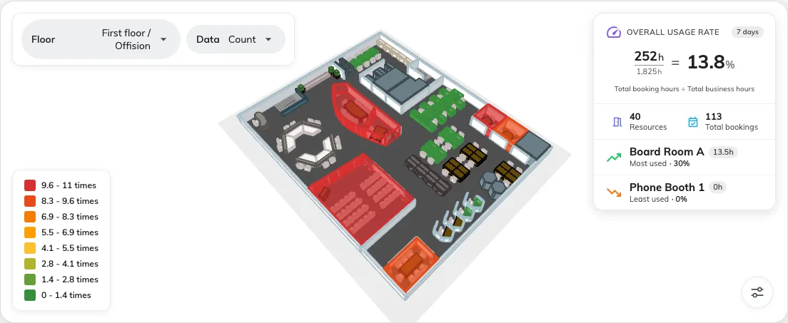
Green through red, the legend that defines the bands, and the summary panel.
The scale is relative, not absolute. The eight bands are rebuilt from the highest value currently on screen, so a red room means the busiest thing in this view — never busy enough. Change the floor, the period, the unit or the resource type and the same room can change colour without a single booking changing. Read the legend before you read the colours, every time.
Click a coloured room or desk to open the resource itself.
The panel in the corner prints its own arithmetic: Overall usage rate is total booking hours ÷ total business hours, for the resources on this floor. Underneath it, Resources counts what is on the floor and Total bookings counts what was booked.
3. Read the cards underneath
Four of them, and the first thing to know is what they are not:
| Card | What it shows | Export |
|---|---|---|
| Usage trend | Bookings as bars against hours as a line, bucketed Daily, Weekly or Monthly | No |
| Resource ranking | The top ten resources with their bookings, hours and usage rate, ordered by bookings | Yes — the whole ranking, not just the ten on screen |
| Top users | Who booked the most, ten at a time, with Show more | Yes |
| Top user groups | The same by group, so a department reads as one line | Yes |
| Peak hours | A heatmap of day against hour, following the Data unit and the rate mode above | No |
Resource ranking and the two Top cards each carry a column chooser, so you can put the columns your own reporting needs into the export. For a quarter-end file of every room, pick Last quarter and the Rooms tab first — Get last quarter’s usage for every room walks through it. Top users can add user attributes to that list; the others offer a fixed set.
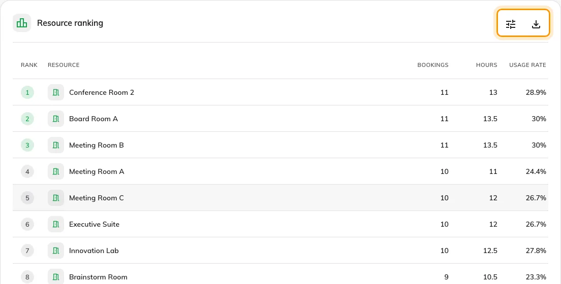
The ranking, with its column chooser and Export.
Peak hours is the card that answers “do we need another room”. A wall of dark between ten and noon and nothing after three is not a shortage of rooms — it is a shortage of rooms at eleven. Click any cell to see the bookings in that hour.
Its columns are the individual dates in the period, not the seven days of the week — there is no weekday breakdown here or anywhere else. And like every card on this page it covers the whole estate for the resource type selected, never one room.
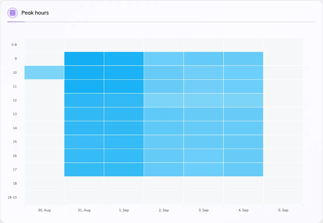
Each column is a calendar date, each row an hour of the day.
4. Check it worked
Set the period to a week you know well, switch to Business hours, and look at a room you know is busy. If it comes back pale, the room’s business hours are probably wider than the hours anybody actually books it for — which is a real finding, not a broken report.
What this does not tell you
-
Whether anybody was in the room. Every number here is booked time. A room booked all week and entered by nobody looks identical to one in constant use — that is what check-in and no-show reporting are for, and what occupancy sensors measure. Where a room counts people, the measured figures are in Check whether the room was actually full.
-
How busy a room is in absolute terms. The colours rank what is on screen against itself. The percentage in the legend and in the summary panel is the absolute figure.
-
How one particular room’s hours look. Peak hours is estate-wide by resource type and cannot be filtered down. Open Booking analytics instead — its filter narrows every view on the page, so its Daily heatmap can be a single room.
Open Booking analytics -
Anything by day of the week. Neither Peak hours nor any other report totals usage by weekday. The heatmap’s columns are dates, and they do not carry a weekday name.
-
Who used it, crossed with anything else. One dimension at a time is all this page offers. For department against resource type, or a cost code against the month, build it in the usage report.