

What decides how a booking looks on the calendar
A booking card's colour comes from its purpose, its lines come from a list you order, and its left edge comes from neither. Which of those a colleague actually sees is the part people get wrong.
Open the booking calendar on a floor that twenty people share and it is one flat wall. Every block the same size, most of them the same grey, and no way to tell the weekly stand-up from the client presentation without opening them one at a time.
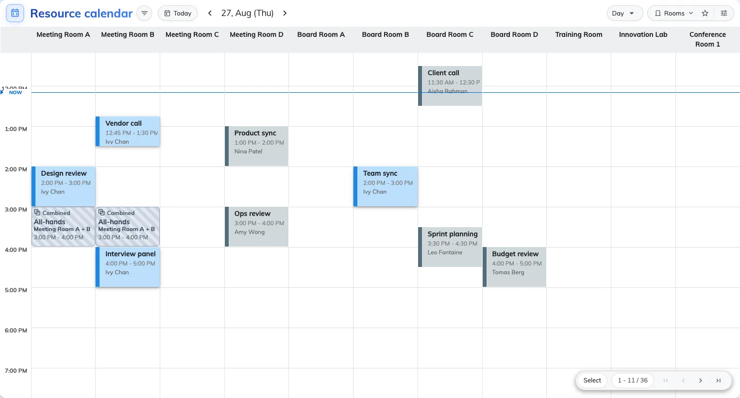
A shared floor before anything is configured: your own bookings in one colour, everyone else's in the same grey.
That is not a fault. It is what the calendar draws before anybody has told it what to say, and three separate things decide what it draws instead.
The colour you pick is not the colour they see
Color, on the booking card, is the colour of a booking that has no purpose — and on the grid people book from, it only ever paints your own bookings. A colleague’s booking with no purpose is drawn blue-grey whoever they are, because it is not yours to read at a glance.
A booking purpose colour is the exception, and that is the whole reason the setting exists: a purpose identifies a booking to every viewer, so its colour is the only one that reaches the room.
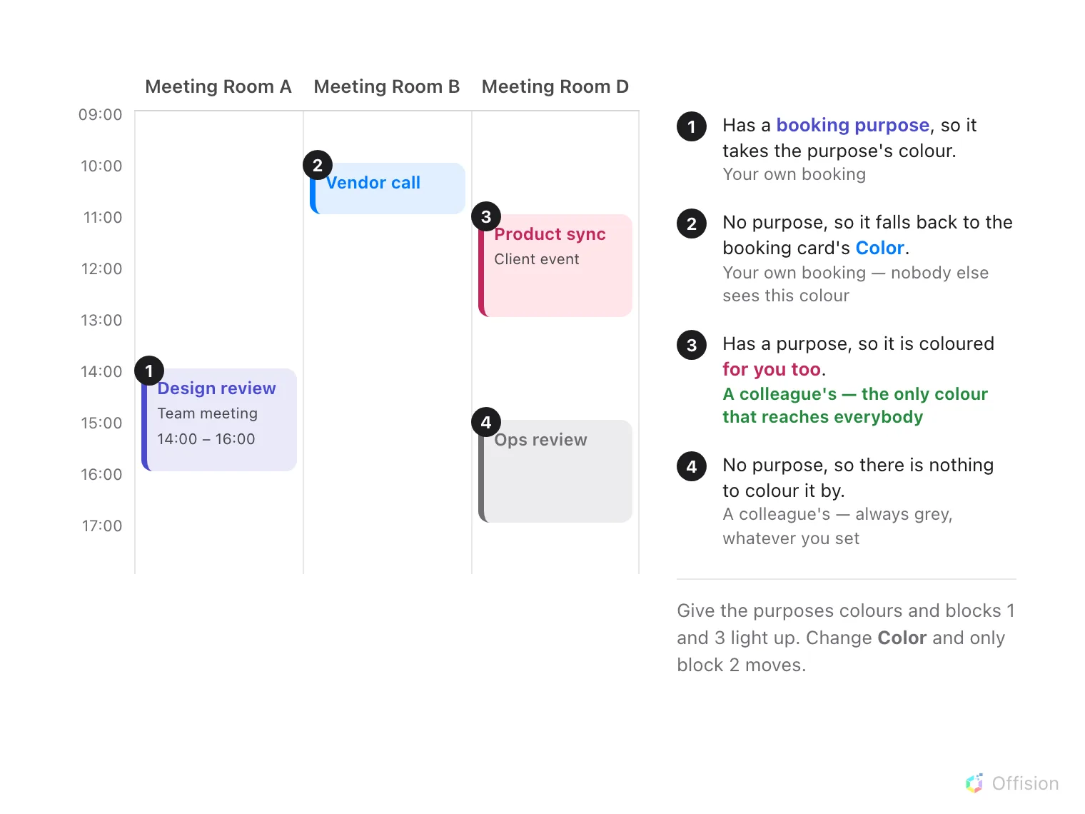
The same grid, four kinds of block. Only the ones with a purpose carry a colour a colleague can read.
One case the drawing leaves out catches people just as often: your own booking waiting for approval is blue-grey even when its purpose has a colour, because “not confirmed yet” is the thing you need to notice about it first.
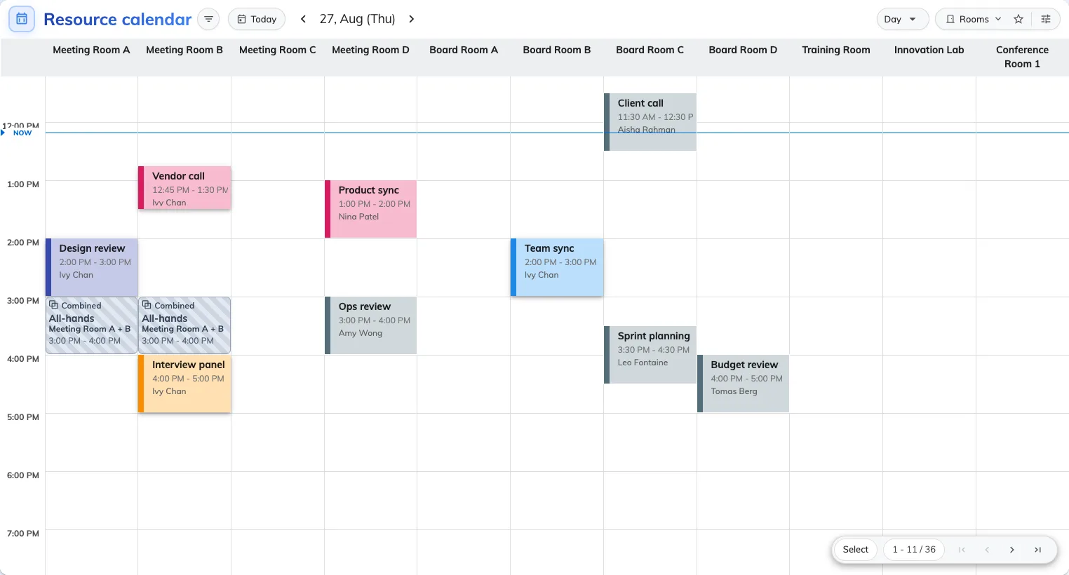
The same day, the same rooms, once each purpose carries a colour.
The lines are a list, and the order is the setting
Under the colour is Fields — the lines a card prints, dragged into the order you want. It is not a set of switches: the order you leave them in is the order they are drawn, top to bottom, and a field with nothing in it draws no line at all rather than an empty one.
A purpose can carry its own field list as well as its own colour, which is how a visitor meeting shows the guest’s company while an internal review shows the project code.
There are two calendars, and they do not agree
The grid people book from and the console’s own calendar are configured on separate screens, and one rule genuinely differs between them: on the console, every block takes the purpose colour whoever booked it — a manager is meant to read the whole estate — and the left edge of every block is the booking’s state, which no appearance setting can change.
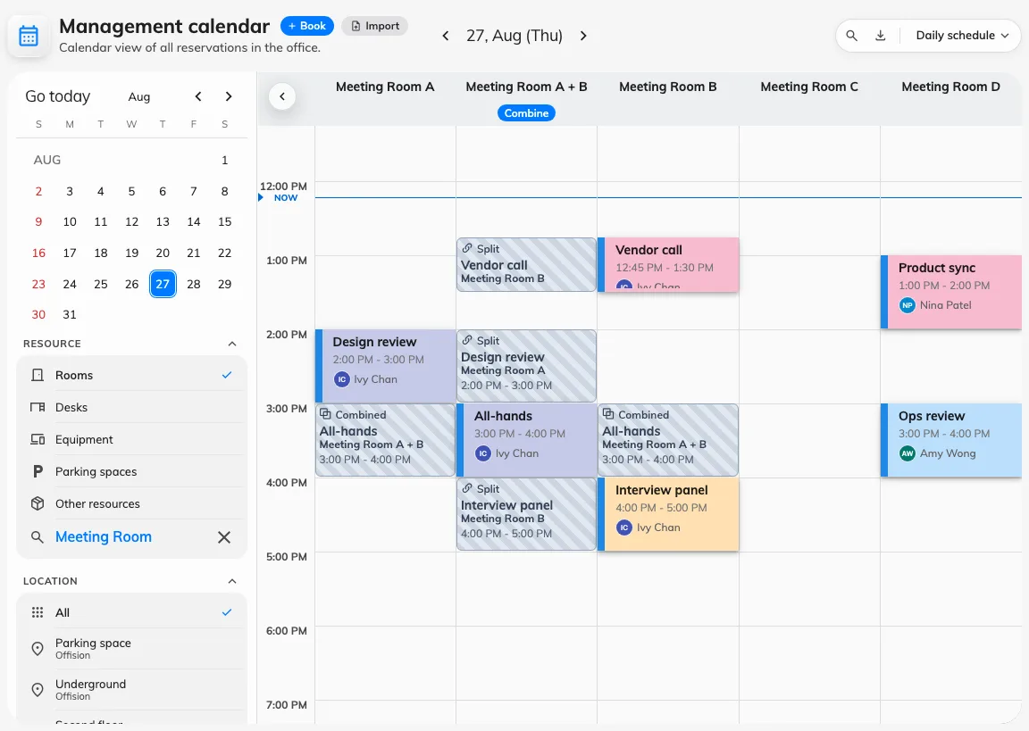
The console's own calendar. The left edge is the booking's state, whatever colour the block is.
What this does not control
- Who may see a booking at all. Hiding a subject is a display choice; a room somebody may not book is a team space.
- What a purpose does to a booking. Its form, its approval and its rules are set on the purpose itself — see What a booking purpose changes.
- The status stripe. The left edge is information, not decoration, and is deliberately not settable.
- Panels, boards and emails. They have their own designs; nothing on these screens reaches them.