

Find a single room's busiest hours
Booking analytics is the one usage page whose filter narrows every chart on it, so the Daily heatmap can show one room's hours instead of the whole estate's. How to filter down to a single room, what the heatmap's rows and columns are, and why no page anywhere breaks usage down by day of the week.
Booking analytics is the usage page to open when the question is about one meeting room rather than about the estate: which hours this room fills, and which hours nobody wants it.
Find it under Booking › Booking analytics.
Open Booking analytics1. Narrow it to the room you mean
The filter strip along the top is the part that makes this page different from Resource usage analytics, where the floor picker scopes only the map and every card beneath it stays estate-wide. Here the filter scopes everything — each of the seven views redraws for whatever set of resources the filter leaves standing.
It filters on Type, Location, Category, Capacity, Amenity, Booking service, and a free-text Search. For one room, type its name into Search. The count under Number of resources on the left tells you what you actually caught — if it reads more than 1, the name matched more than one room.

The filter narrows all seven views underneath it, not just one.
Set the period on the left as well. It cannot be pushed past today.
2. Open the Daily heatmap
The tabs across the header are the seven views of the same filtered data:
| View | What it shows |
|---|---|
| Timeline chart | Usage over the period, bucketed by hour up to month |
| Snapshot map | The floor plan as it stood at one chosen moment |
| Usage map | The floor plan coloured by usage over the period |
| Daily heatmap | Hours of the day against the dates in the period |
| By resource table | One row per resource |
| By time table | One row per time bucket |
| By user table | One row per person |
Daily heatmap is the one that answers the question. Pick it.
3. Read it
Each row is an hour of the day; each column is one date in the period. Data above the grid decides what the shading measures — Count, Total hours, Total minutes or Percentage. Click any cell to list the bookings that made it.
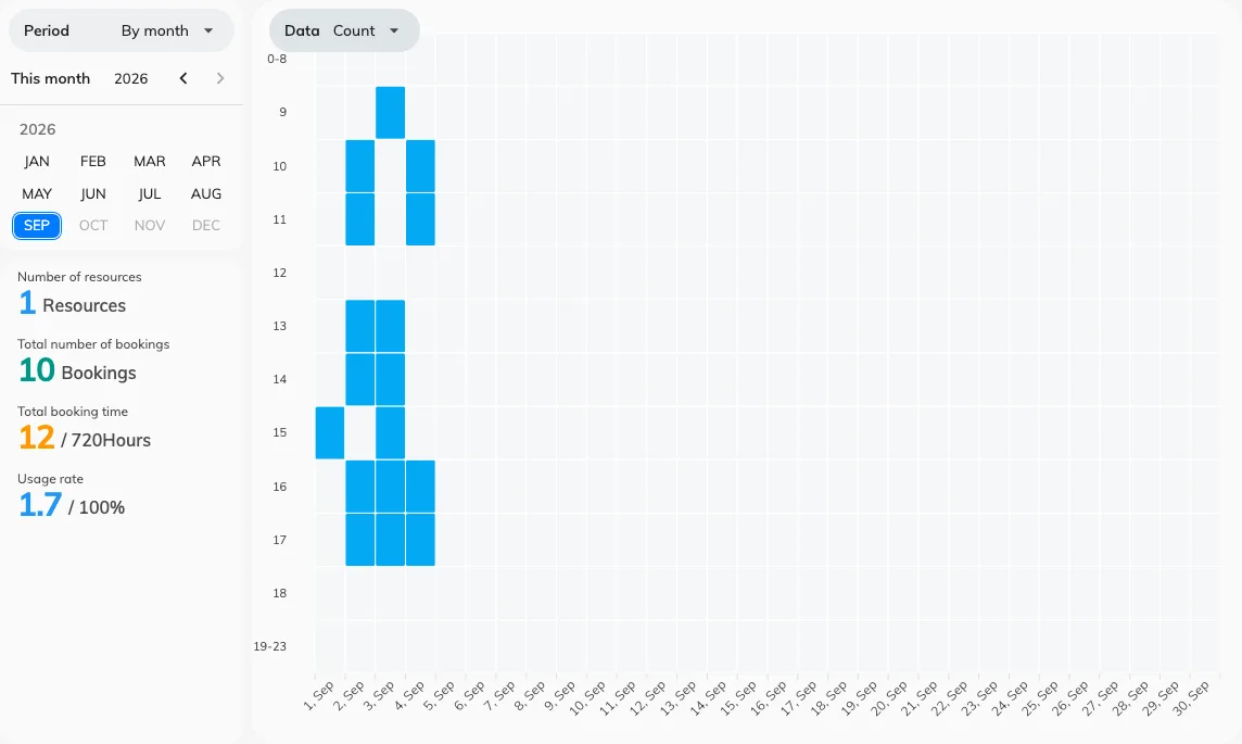
One room, hours down the side and dates across the top.
With the filter down to one room, the shape the dark cells make is that room’s answer to “when is it actually wanted”. A band that repeats at the same hour day after day is the case for a second room at that hour, rather than simply for a second room.
4. Check it worked
Put a room you know well into Search, set the period to a few days you remember, and read the heatmap against the bookings you can recall. Then clear the filter: the same grid should darken everywhere, because it is now every resource in the estate at once. If it does not change, the filter never applied.
What this does not tell you
- Anything by day of the week. There is no weekday axis, no weekday total, and the date columns do not print a weekday name — so “are Tuesdays busier than Fridays” has to be counted off the dates by eye, over a period you choose to make that readable. No page in Offision aggregates it for you.
- A business-hours percentage. Percentage here is measured against every minute of the period, around the clock. The business-hours divisor — booked hours over the hours a resource was actually open — is on Resource usage analytics, and what goes into it is in What a room’s usage rate counts. The two pages will disagree about the same room, and that is why.
- Whether anybody turned up. Every figure here is booked time. A room held all week and entered by nobody reads as busy — see what counts as a no-show.
- Two dimensions at once. For department against resource type, or a cost code against the month, build it in the usage report.