

The panel is too cramped on a small screen
An 8-inch panel draws the same layout as a 10-inch one, so the fix is showing fewer things rather than smaller ones. Five causes, starting with the schedule column that holds a third of the screen until somebody folds it away.
The panel is laid out in proportions of its own screen rather than in fixed sizes. An 8-inch panel and a 10-inch panel running the same resolution therefore draw pixel-for-pixel the same screen — the 8-inch one is simply read from the same distance at half the size. Nothing thins itself out for a smaller panel, so the only lever is making it draw fewer things.
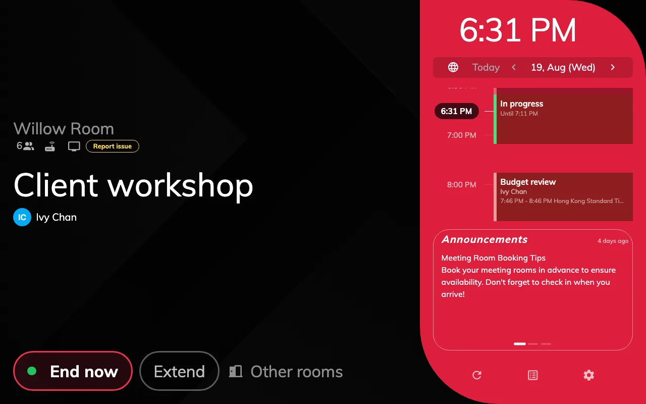
The standard layout. The schedule column holds about a third of the screen.
The schedule column is taking a third of the screen
Most commonThat column never drops below a quarter of the panel’s width, and on a normal booking screen it takes about a third. Everything the room actually has to say — its name, its status, the buttons somebody came to press — is squeezed into what is left.
Turn on The timeline area is collapsed by default, the last switch in the configuration’s Timeline & clock group. The column folds into a narrow tap rail, and the content pane widens from roughly two-thirds of the screen to nearly all of it.
Open Panel configurations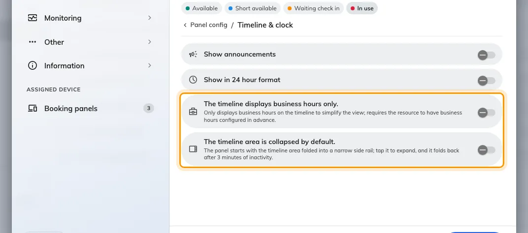
Timeline & clock, with the two timeline switches at its foot.
Know what folds away with it. The clock survives, turned on its side in the rail, but the language button, the announcements and the control bar go with the schedule. The booking’s own times are not lost — they move into the left pane while the column is folded.
Anybody at the panel taps the rail to open it, and a chevron on its edge folds it back by hand. Left alone it re-folds itself after three minutes without a touch, so a panel somebody opened at nine is not still open at noon.
A panel mounted on its side does this without being asked: in portrait the column starts folded whatever the switch says, because at that width it would be a sliver. See Mount a panel in portrait.
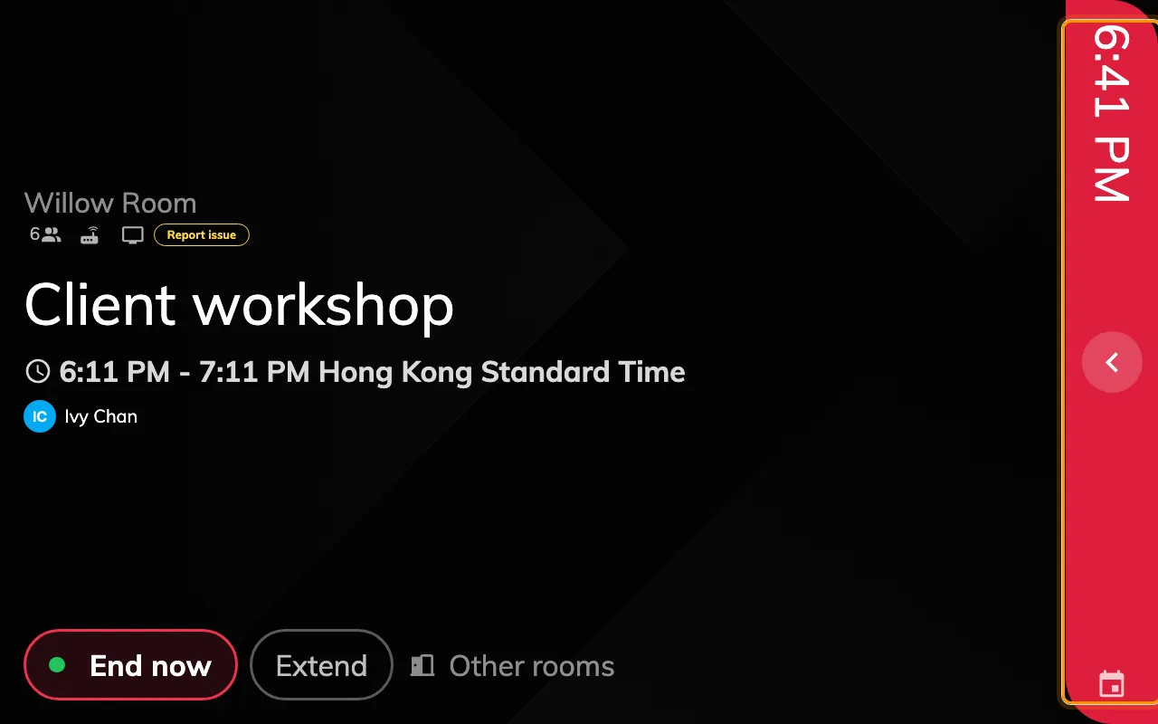
The same panel with the column folded into its tap rail.
Every optional row is switched on
Most commonRoom booking panel carries a switch for each thing the panel can draw, spread across its Room details, Booking details and Timeline & clock groups, and they arrive on: Show Organizer — with its own title and staff ID nested underneath — Show attendees, Show user thumbnail, Show amenities and capacity, Show Online Meeting Logo, Show announcements and Show company logo. Each is a line the panel has to find room for whether or not anybody reads it.
Two of them cost more than their size suggests:
- Text size set to Large rather than Maximize holds the room’s name at a fixed size instead of letting it take the space it is given, which on a small panel is how a long room name pushes everything below it down. See Make the text on a room panel larger for what each size does.
- Show QR Code for booking, over in Use a booking, pins a card to the corner of the content pane and reserves its width permanently. The action buttons then wrap onto a second row as soon as there are more than about three of them.
The button switches in Use a booking, Book from the panel and Door & extras are the same trade — Show extend button, Show other rooms button, Show report issue button and their neighbours each cost a button’s worth of row. Turning off the ones your rooms genuinely do not use buys back more room than any single display switch.
A configuration is shared, so this is not a choice you have to make for the whole estate: leave the panels with space to spare on the configuration they are on, and give the small ones one of their own.
The schedule is drawing the whole day
CommonLeft alone the column covers all 24 hours, so the working day occupies a third of it and every booking in it is a thin band.
The timeline displays business hours only, immediately above the collapse switch in Timeline & clock, narrows it to the hours the room is open, with an hour or two of padding either side.
This one depends on something outside the panel: the resource has to have business hours set. With none there is nothing to narrow to, and the switch changes nothing at all — which is how it gets reported as broken. Set the hours on the room first, the same ones that limit booking to business hours.
The panel's display scale was set by hand
Less commonChange scale, in the manager console on the panel itself, magnifies the whole interface on that one device. Set above the scale the panel chose for itself, a screen that used to fit stops fitting, and because everything grows together it reads as a layout fault rather than a zoom.
It is set on the device and not in the configuration, so this is the cause to suspect when one panel is cramped and an identical one beside it is not. Open the manager console on the panel and set the scale back to Auto, which carries a Recommended badge and clears whatever was stored.
Auto is worth understanding, because it is not the same as 1. An Android panel reports a display density of its own — a 1280 × 800 panel typically reports 1.5 — and at a scale of 1 the interface is laid out as though the screen were only 853 pixels wide, which is narrower than the layout is designed for. Auto aims the long side at about 1280 pixels instead, so the panel lays out at the resolution it actually has. Choosing 1 by hand on such a panel is what causes the cramping rather than curing it.
Every row in the dialog states the layout resolution it resolves to, so the choice can be read rather than guessed. The list runs below 100% as well as above it, down to the panel’s own 1:1 physical resolution — useful for fitting more on a dense screen. A panel with no density headroom floors at 1 and offers the same list it always did.
The screen is small enough to be a different layout
Less commonAt 560 pixels wide or narrower, or under 480 tall, the panel stops drawing the standard layout and switches to a compact one: a single column, one thing at a time, and no schedule at all. Both timeline settings are inert there, because there is no column left for them to act on.
That threshold is a screen size, not a physical one. An 8-inch panel running 1280 × 800 is nowhere near it and draws exactly the layout a 10-inch panel draws; the devices that land on the compact layout are the small door plates and anything mounted in a frame that narrow.
So when the complaint is that the 8-inch panels are cramped, this is not the cause — solutions 1 and 2 are.