

Choose a panel design
A booking panel renders one of two layouts. Scheduling is the full panel with a side rail; Center is one column of type and draws far less — which is why half the settings go grey when you pick it.
A booking panel renders one of two designs, and they are two layouts, not two colour schemes. The design is set on the configuration, so it lands on every panel sharing it.
Open Panel configurations1. Pick the design
Open the configuration. It opens on Room booking panel: a live preview of the panel, with the two designs as thumbnails beside it, a row of room-state chips under the preview, and the settings groups below that. Open a group and the round chevron above its list brings you back.
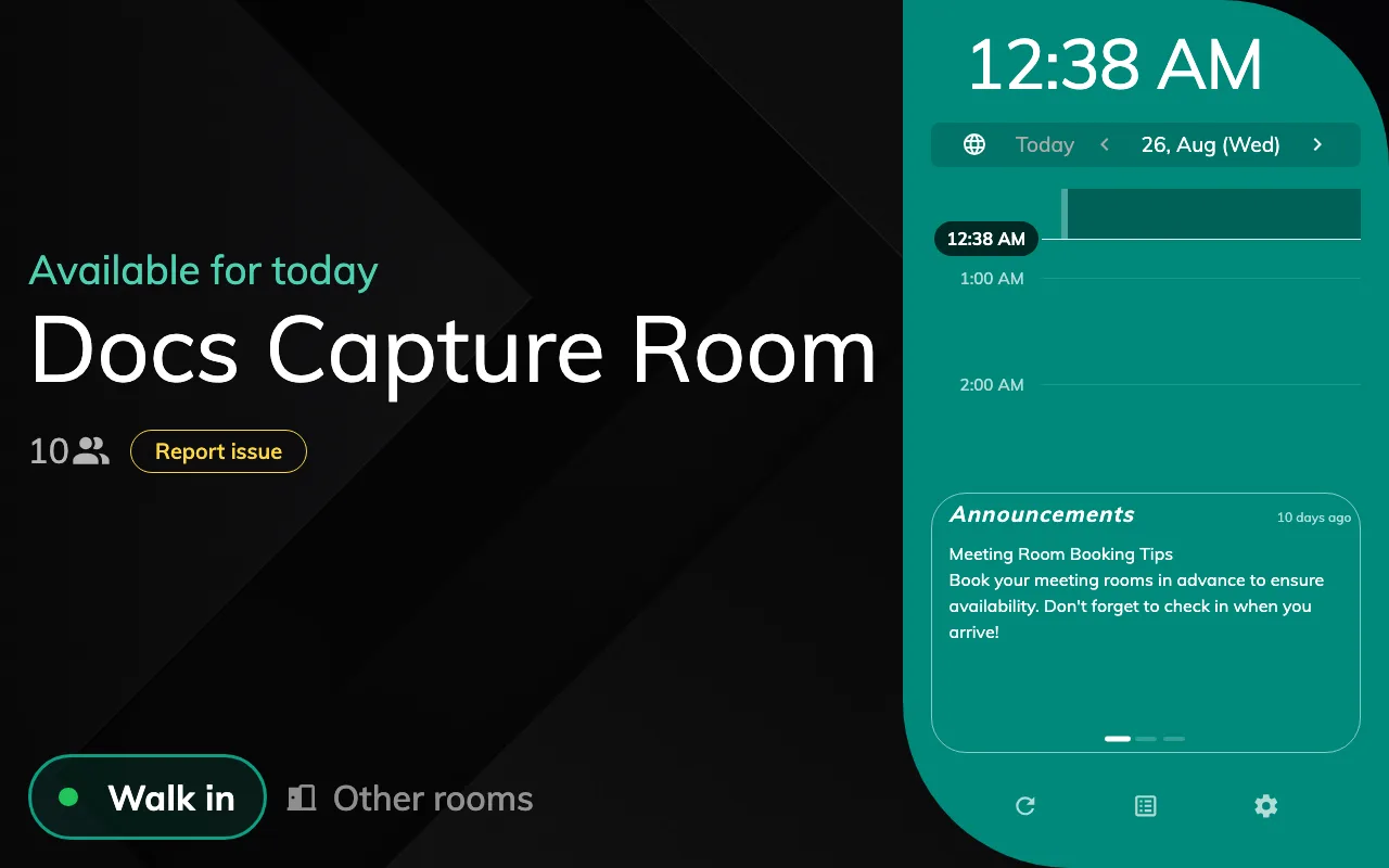
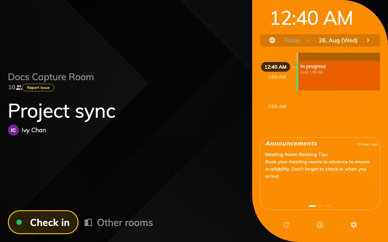
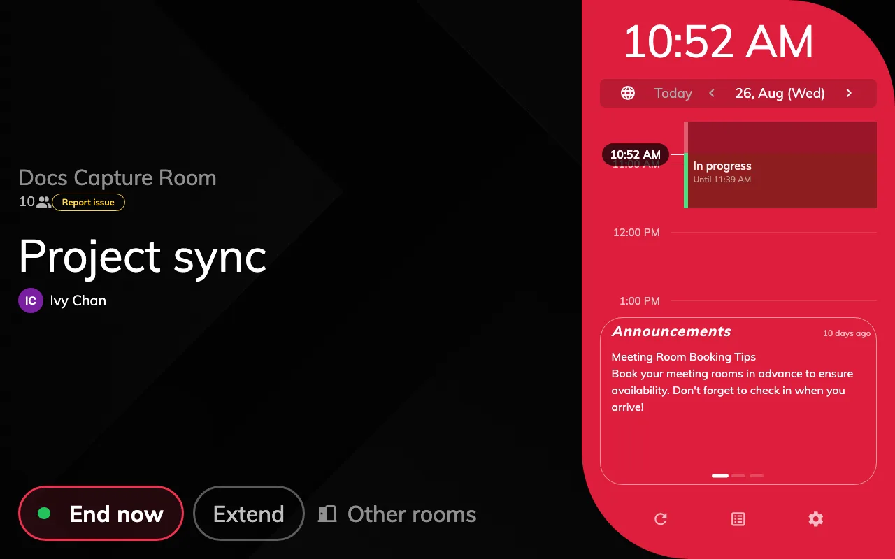
- Scheduling is the full panel: the room block on the left, a side rail with the day’s timeline, the action row, and room for a background image and a logo.
- Center is one centred column on a flat near-black ground. No rail, no time grid, no background image, no gradients. The status colour appears in exactly two places — the state word and the primary button — and the hero is the room name while the room is free, the booking title while it is not.
Center suits a door where the answer is “free or not, and for how long”. Choose Scheduling where people are expected to read the day off the wall.
Scheduling
Center
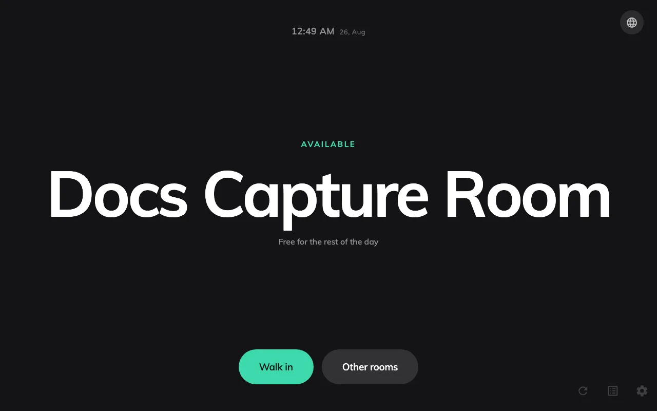
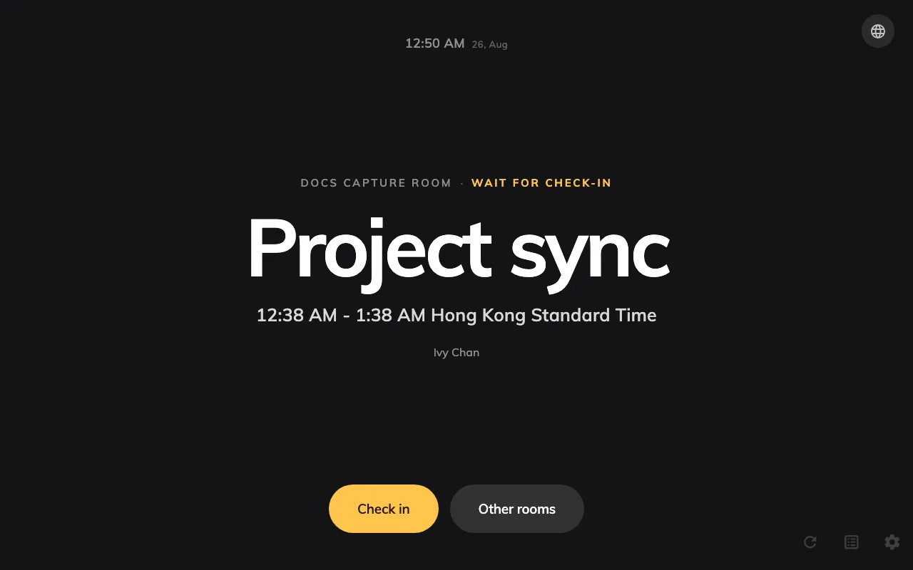
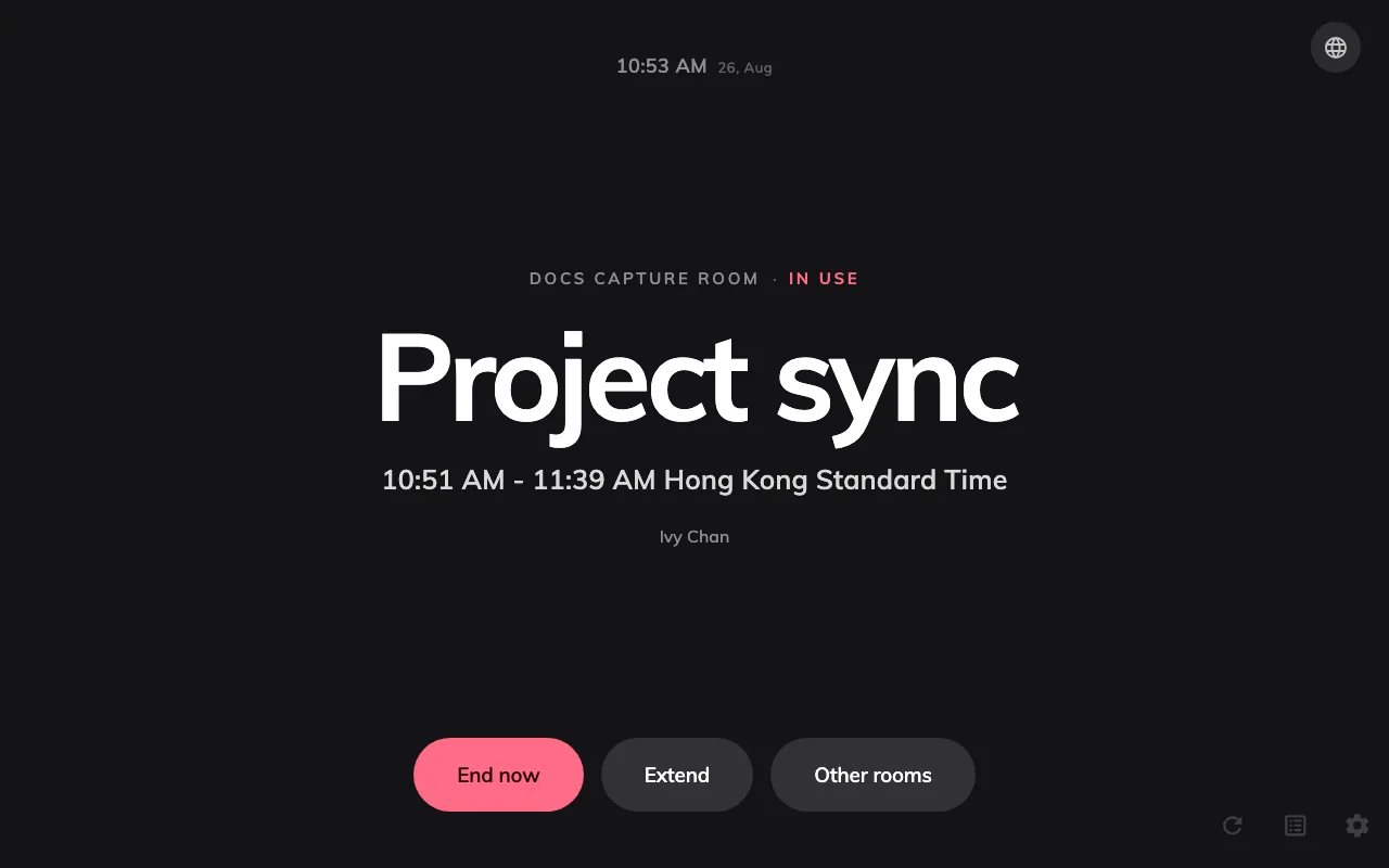
Same room, same booking, photographed under both designs. Orange is waiting and red is in use on both — see What the panel colours mean.
2. Expect settings to go grey
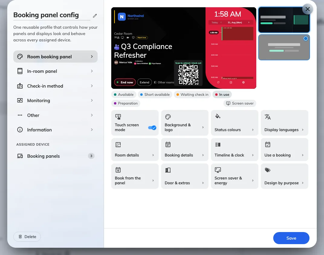
The groups under the preview. A group the design cannot draw is dimmed.
Center has no surface for a good many settings, so the form disables them rather than letting you change something the panel will ignore:
| Not drawn by Center | Where it lives |
|---|---|
| Background image mode and file, the company logo and its ground, room name text size | Background & logo, Room details |
| Amenities, and their names | Room details |
| User thumbnails, organizer title, organizer staff ID, “Anonymous” when there is no organizer, online-meeting logo | Booking details |
| Announcements, business-hours-only timeline, timeline collapsed by default, timeline text size | Timeline & clock |
| QR code for booking | Use a booking |
| Advance booking, confirmation on a new booking and the two fields under it, booking details, cancel booking | Book from the panel |
| Report issue | Door & extras |
Scheduling draws all of them. Anything not in that table works on both.
3. Override one booking purpose
The last group, Design by purpose, gives an individual booking purpose a design of its own — so a room that runs classes can render a different panel for those bookings without a second configuration.
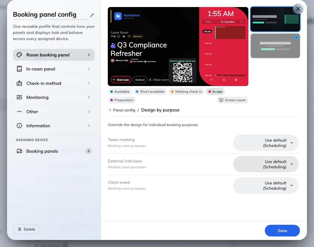
One row per purpose. Anything left on Use default follows the design above.
4. Check it worked
Save, confirm the list of devices the change reaches, and look at a panel. Every panel on that configuration redraws itself within about a second — there is nothing to refresh or reboot afterwards; see Panels and screens update the moment something changes.
If a panel still draws the old layout, check it is on the configuration you edited rather than a second one — see How a panel gets its settings. A panel that was offline at the moment you saved keeps the old design until it is rebooted.