

Read the visitor dashboard
What each of the Visitor Dashboard's four numbers counts, how the trend arrows compare against the previous period, and what the building breakdown, top insights, purpose and walk-in charts are telling you — plus the two filters that change all of it at once.
The Dashboard is the period view of visiting: pick a stretch of time and it says how that stretch went — how many people, how many made it, how many never showed — and where they went. It is view-only; when you need the same records as a file, that is the Visiting daily report or the Visitor badge list’s export.
The two filters
Everything on the page obeys the same two controls at the top. The date range opens on the current month; the buildings picker starts at All buildings and only shows buildings enabled for visiting. A filter you applied last visit stays applied — when a number looks impossibly low, look here first.
Open Visitor DashboardThe four numbers
| Tile | Counts |
|---|---|
| Total Visitors | The period’s headline count |
| Currently Visiting | Badges checked in right now — Active now is live, not historical |
| Checked Out | Completed visits, with the Completion rate — their share of the total |
| No Show | Missed appointments, with the No show rate |
The small arrows under Total Visitors and No Show compare against the previous period of the same length — a two-week range is compared with the two weeks before it. There is no arrow when the previous period had nothing to compare with.
No-shows are only counted where the visiting policy marks them: an invitation nobody checked in on flips to No show automatically once its time passes, and with that change turned off the rate reads zero however many people failed to arrive.
Visits per day
The chart under the tiles plots visitors per day across the range. Spikes are usually one event’s guest list; a flat zero inside an otherwise busy month is worth checking against the building filter before against reality.
Building breakdown
One row per building with six counts: Total, In now, Checked out, No show, Invited and Walk-in. Busiest building first. This is the table to read when deciding where reception cover is thin — a building with a high walk-in share is one where visitors arrive unannounced.
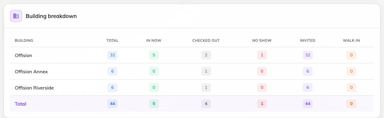
Every building in the filter, busiest first.
Top insights
Two top-five lists: Frequent visitors — the people who came most often, with their company and visit count — and Top inviting users, the employees who invited the most. Frequent visitors is where a contractor who should have a long-term badge shows up; top inviters is who to talk to before changing a visiting form they use daily.
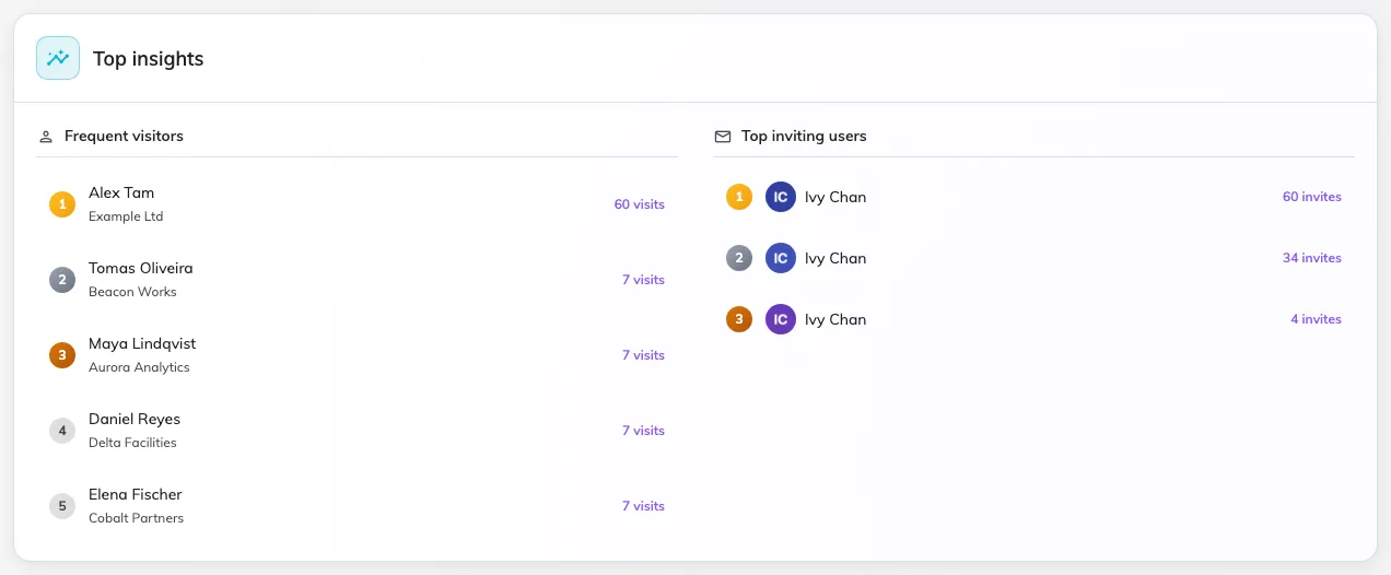
Who keeps coming, and who keeps inviting.
Purposes, and invited vs walk-in
The last row splits the same visits two ways: Visiting type distribution shows which purposes the period’s visits used, and Invited vs walk-in splits announced from unannounced arrivals, week by week. A purpose that never appears here is a candidate for deletion; a rising walk-in share means invitations are being skipped, not that visiting is growing.
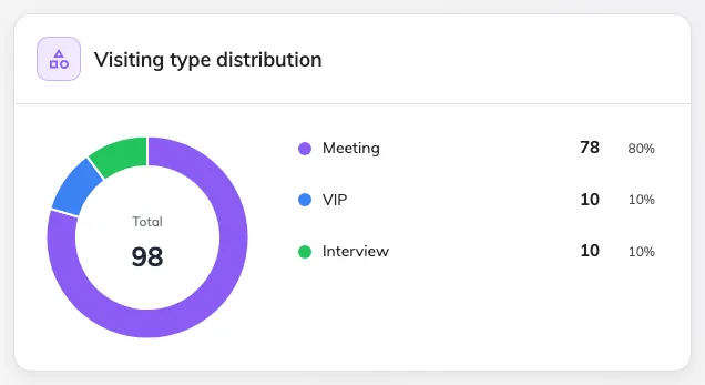
Which purposes the period's visits actually used.
What this page does not do
- Export. The dashboard has no download. The Daily report exports one day; the Visitor badge list exports any period.
- Name individuals beyond the two top-five lists. Person-level questions belong on the Visitor badge list or in a visitor’s record.
- Live occupancy. Currently Visiting is the one live number here; the fuller “right now” picture is the Overview page’s quick-view cards.