

Layout settings
Change a layout once its shape is chosen — the four things it sets: the seams you drag and their limits, the rail's rows for the dock, cards, buttons and side list, up to three text bars, and the reserved strip a sharing display needs.
Once a layout’s shape is chosen — which is Change a layout — four things remain to set. None of them changes the kind of layout you picked; they decide its proportions and which of its areas exist.
The seams
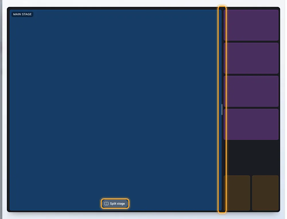
Every proportion on the layout is a grip on the line it moves.
Proportions are dragged, not typed. Each seam carries a grip and shows a live percentage while you move it, with marks at the two limits:
- the dock may take between 16% and 40% of the screen,
- a split stage divides anywhere between 30/70 and 70/30,
- in Overlay, each float has a bar on its free edge — the card stack is pinned right so its left edge widens it, the button row is pinned to the bottom so its top edge grows it.
There is no dock-width slider anywhere in the rail, on purpose: the grip on the seam says where the edge is as well as how wide the dock has become, and a slider could only ever say the second thing.
Push a seam past its limit and the layout changes kind rather than stopping: a second stage squeezed too narrow becomes the side list, and a side list dragged wide enough becomes a second stage. Both directions work, so it is never a trap.
A grid has no seams at all. Its cells are exactly equal by definition, so there is nothing to grip and nothing to drag out of alignment — which is the point of choosing a grid over two stages you have to keep level by eye. The split capsule is hidden there for the same reason.
The rows
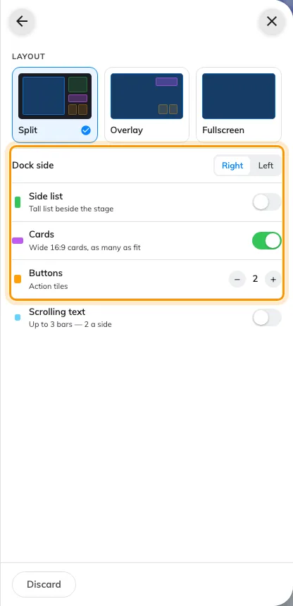
The answers that have no shape to point at, each led by its area's own colour.
| Row | What it does | When to change it |
|---|---|---|
| Dock side | Which edge the dock sits on, left or right | The screen is beside a doorway or a corner and one side reads better than the other |
| Side list | Adds the tall column at the top of the dock | The screen should carry a running list — today’s bookings, expected visitors — beside its main content |
| Cards | The row of 16:9 information cards | A clock, the weather or a summary should be visible without taking the stage |
| Buttons | The row of 3:4 action tiles | Somebody has to be able to press or scan something |
| Card band / Button band | Which edge each band sits on, in portrait | Buttons default to the bottom because that is where a hand reaches on a tall screen; move them only if something else needs that edge |
| Reserved area | Keeps the bottom of the stage clear | The screen is a wireless-sharing display, so the device paints its own connection details there |
A control that cannot do anything on this layout is hidden, not greyed out — a side list is impossible in Overlay and in portrait, so the row is simply absent there. Do not go looking for it.
Text bars
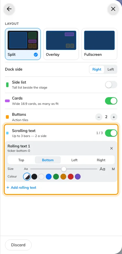
Up to three bars, no more than two on a side, each with its own edge, size and colour.
A screen can carry up to three text bars and no more than two on any one edge. Each one names its edge, its Size and its Colour — Match board or one of seven fixed colours, for the notice that has to look different from everything else on the screen.
A band does not have to scroll. Besides the two scrolling widgets it can carry the fixed Info bar — a clock, the weather and live sensor readings, standing still.
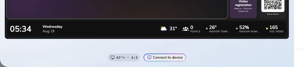
A bottom band carrying the info bar: clock and date left, data chips right.
Top and bottom bars run across the full width and own the corners. Left and Right bars run vertically, taking the height between the top and bottom ones, and their text stands on end — Chinese and Japanese read down the band naturally, and Latin letters and digits turn a quarter turn with them.
Reserved area
Reserved area appears only on a 43-inch-or-larger landscape 16:9 screen, and only exists for one reason: a wireless-sharing display paints its own connection information — the room name, the code to join — over the bottom of the screen, and that card is not something Offision draws or can move.
Turning it on keeps the bottom strip of the main stage clear. Nothing else shrinks: the dock keeps its full height, and the cards and buttons keep their count. A bottom text bar is allowed to sit inside that strip rather than adding to it, so the stage never pays for the same pixels twice.
What these do not control
- Which shape the layout is. Style, and splitting the main stage, are on Change a layout.
- What goes in each place — see Widgets and the places they go.
- The screen’s size, shape and orientation. Those are in the Screen size dialog, which the caption under the preview opens; changing them re-fits everything here rather than replacing it.