

Change a layout
The layout page composes the screen's shape from about a dozen answers — where the dock sits, how wide it is, how many cards and buttons, which edges carry a text bar — and re-fits the content to any of them.
There is no catalogue of layouts to pick from, and there is nothing to drag on the preview itself. A layout is composed from about a dozen answers — one big stage or two, a column beside it or not, how many cards, how many buttons, which edges carry a text bar — and the design redraws itself to fit whatever you answer.
That is why nothing you chose when the content was created is final. Every answer, including the screen’s size and shape, can be changed later and the design re-fits.
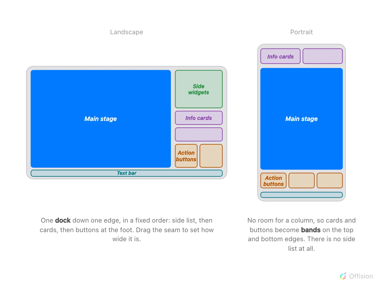
The five named areas, and the two ways a layout arranges them.
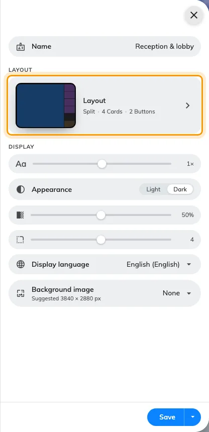
The Layout card on the editor's first page, drawn as the screen's own shape with its answers summarised.
The preview goes away while you compose
Open Layout and the live preview is replaced by a flat schematic of itself.
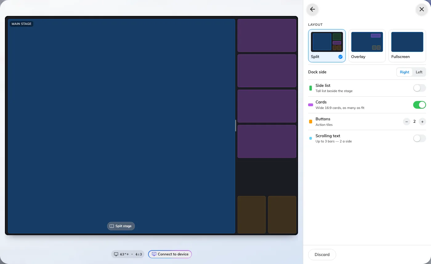
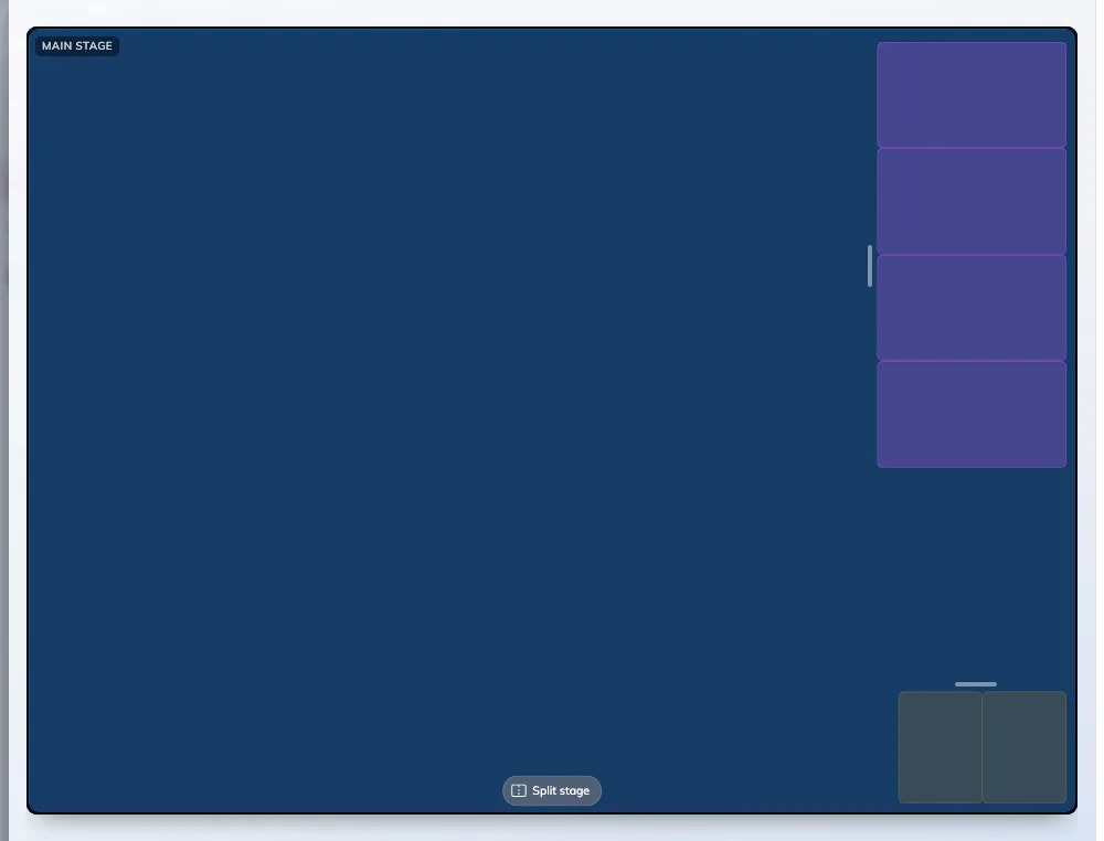
The composing canvas: every area named, nothing pictured, and the seams draggable.
This is deliberate and it is worth understanding, because it looks at first like something has broken. Live content hides the structure you are editing — a photo scene fills the stage edge to edge, and you cannot see what you are moving. So each area is drawn as a flat colour with its name on it, and the widget assigned to it named underneath rather than drawn.
That also answers the only question a layout change really raises: what am I about to lose. The names tell you.
Nothing is committed while you are here, and the screen underneath keeps rendering what it had. Discard at the foot of the rail throws the draft away. The ← arrow is what applies it — leaving the page is the commit, and the design re-renders once, as you go. There is no Save button on this page at all, because there is nothing to save until the content has adopted the layout.
Style: the shapes a layout can take
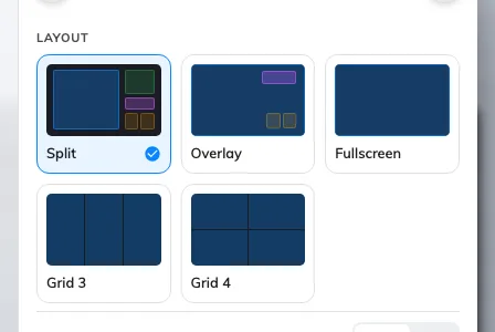
Split, Overlay, Fullscreen, Grid 3 and Grid 4, drawn rather than named.
Split gives the main content one part of the screen and puts everything else in a dock along one edge — a column on the left or right in landscape, a band across the top or bottom in portrait. It is the ordinary answer.
Overlay runs the main content edge to edge and floats the cards and buttons over it, in the corners. Use it where the content is a photograph or a video that deserves the whole screen and the rest is secondary.
Overlay: the main content keeps the screen, the cards and buttons float over its corners.
Fullscreen is the stage on its own. Everything else disappears — but it is not thrown away: the cards, the buttons and the side list are kept dormant, so switching back to Split restores the shape you had rather than an empty one.
Grid 3 and Grid 4 are the video-wall answer: three or four equal stages filling the screen edge to edge, each playing its own content. Grid 3 divides along the screen’s long axis — three columns in landscape, three rows in portrait. Grid 4 is 2×2 whatever the shape, which on a very wide screen gives four cells of ordinary proportions.
A grid keeps Fullscreen’s rule about not throwing anything away: the dock, the cards, the buttons, the side list and the split you had all stay dormant while you are in a grid, and come back as they were when you leave it.
Splitting the main content in two
The pill at the bottom of the stage reads Split stage while there is one, and Combine once there are two. On a landscape screen it is a capsule of two icons rather than a single pill: either icon splits that way, the lit one combines, and pressing the unlit one flips the cut in place without losing the stages.
That is the choice between Side by side and Stacked. A landscape screen can be cut either way; a portrait screen is too narrow for two stage columns, so it is always stacked and the capsule does not offer the choice.
Two stages are two independent screens sharing one panel: each plays its own content, its own scenes, and its own takeovers. An announcement interrupting the left half leaves the right half alone. The same is true of every cell in a grid — Third stage and Fourth stage are stages in their own right, not subdivisions of the first.
Every proportion and row, in detail
Seams are dragged rather than typed, the rail’s rows switch each area on and off, a screen can carry up to three text bars, and a wireless-sharing display gets a reserved strip. All four are settings rather than shape decisions, and they are listed field by field in Layout settings.
Check it worked
Leave the page with the ← arrow, which applies the layout, then Save. The design re-renders once with its new shape.
Anything that no longer has a place is not deleted — put the card or the button back and its widget returns with it. That is what makes composing safe to experiment with: it is the layout that changed, not the content.
What this does not control
- What goes in each place — see Widgets and the places they go.
- The screen’s size, shape and orientation. Those are in the Screen size dialog, which the caption under the preview opens, and changing them re-fits the layout underneath rather than replacing it.
- How large the text is. Font size is a display setting, not a layout one, and it deliberately does not change the size of the areas — only what is written inside them.