

Both maps
UI customization settings reference
Change how Offision looks, page by page — every field on the eight UI customization pages: the two logo pages, the two calendars, the sticker menu, the booking form, the floor-plan labels and the catch-all.
Eight pages, in rail order. Every one of them saves from the same footer, which appears once something has changed.
Open UI customizationFloor-plan label defaults are separate from map authoring. Map 2.0’s grid, shadows and snapping are edited in its designer’s Display controls, not in Classic 3D preview settings. Changing label defaults does not migrate a drawing.
Home page
| Field | What it does | Notes |
|---|---|---|
| Use Transparent Background for Logo | Off, one logo drawn on white. On, two logos and no backing tile | The switch decides which fields below exist |
| Home page logo | The single logo, on a white background | Only while the switch is off. 348×88 |
| Home page Logo (For light theme) | The logo a reader in light theme sees | Only while the switch is on |
| Home page Logo (For dark theme) | The logo a reader in dark theme sees | Only while the switch is on |
| Home page layouts | Which home cards people get, each with its own Enable switch, in the order you drag them | Rows marked Default are what a new account starts with |
| Allow user create their own layouts | Lets a person add pages of their own | |
| Allow user reorder the page | Lets a person move the cards you set | Turning it off does not undo a rearrangement already made |
| Allow user upload profile background | Lets a person replace their backdrop | |
| Hide floor plan on home | On, Home is the timeline at full width: the floor-plan panel beside it goes, and so does the chevron that used to show and hide it. Tenant-wide, off to begin with | Turn on where the plan is empty, or where Home should be one column. The Indoor map widget and page are unaffected |
Login page
| Field | What it does | Notes |
|---|---|---|
| Use Transparent Background for Logo | The same fork, for the sign-in card | |
| Login page logo | The single logo, on a white background | Only while the switch is off |
| Login page Logo (For light theme) | Only while the switch is on | |
| Login page Logo (For dark theme) | Only while the switch is on | |
| Login page image | An image of your own beside the sign-in card | |
| Hidden local login in User Portal | Removes the email and password form | Only once single sign-on covers everybody |
| Show instruction text in User Portal Login page | Shows a block of your own text under the form | The text is edited beneath the switch |
Resource calendar
The user portal’s booking grid. Covered in full by Restyle the booking calendar people see.
| Field | What it does | Options |
|---|---|---|
| Column width | How many resources fit on screen | Narrow / Normal / Wide |
| Row height | How much of the day fits without scrolling | Compact / Normal / Tall |
| Color | The colour of a booking with no purpose | |
| Show other users’ appointment subject | Whether a colleague’s booking says what it is | |
| Show title of appointments waiting for approval | The same, for a booking not yet confirmed | |
| Fields | The lines a booking card prints | Booking / People / your custom fields |
| Booking purpose card | One override per purpose — its own colour and fields | A purpose with no override uses the default card |
| Show full details for others’ bookings | Under Booking details. Opens the same booking card as your own on a colleague’s booking; actions stay hidden | On where colleagues need each other’s notes and attendees. Off (the default) leaves the reduced card |
Schedule
| Field | What it does |
|---|---|
| Convert to online meeting | Offers “drop the room and add an online meeting” on the sticker’s Cancel menu |
| Cancel room booking only | Offers “keep the meeting and attendees; release the room only” |
Both are covered by Choose what the cancel menu offers.
User booking form
| Field | What it does | Options |
|---|---|---|
| Resource description | Whether the chosen room’s own description prints under the resource picker | Hidden / Show description / Show as caution |
| Allow booking multiple sessions as one series | Under Multiple booking. Whether Series is offered as a booking mode at all. Off hides it from the booking form, from the mobile mode menu and from the nudge that suggests switching to it — it is never shown greyed out | On, unless it has been turned off |
| Maximum bookings per series | Under Multiple booking, and only while the switch above is on. How many sessions one series may hold | 1 to 200. 50 applies until somebody sets it |
| Import bookings | Under Import. Whether the Offision app offers Import — on the Schedule header, in Home’s quick actions and under Room in the footer — to anyone who can book a room. The sheet carries a Series ID column only while the series switch above is on; see Import bookings from a spreadsheet | Off, unless it has been turned on |
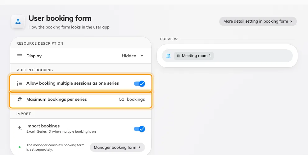
Multiple booking, on the form it governs. The count row appears only while the switch is on.
Show as caution draws the same words on an amber notice. It is informational either way and never blocks a booking. Covered by Show a room’s description on the booking form.
Only resources that have a description contribute, so the block does not appear on a form where nothing has anything to say.
Floor plan
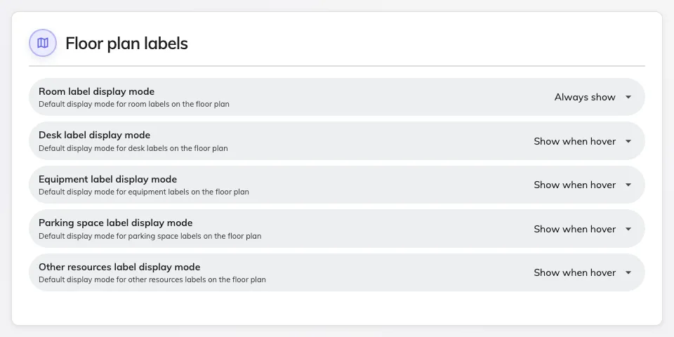
One label mode per resource kind.
One field per resource kind — Room, Desk, Equipment, Parking space and Other resources — each set to Always show, Show when hover or Hidden.
These are defaults, not locks: a reader can still turn labels on for a map where you hid them. Set what a map should look like when it first opens.
Others
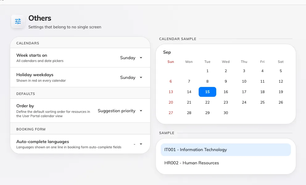
The catch-all: the day the week starts on, a default order, and the languages a booking form's auto-complete fields show.
Calendars sits first on the page, above the defaults.
| Field | What it does | Options |
|---|---|---|
| Week starts on | The first column of every calendar and the first column of every date picker, across the console, the user app and the mobile apps | Sunday (default) / Monday / Saturday |
The rest of the page:
| Field | What it does | Options |
|---|---|---|
| Order by | The default order of resources in the user portal calendar | Suggestion priority / Favourite / Last booking time / Location / Name / Capacity / Availability |
| Auto-complete languages | Under Booking form. Which languages appear on one line in the booking form’s auto-complete fields | Any of the tenant’s enabled languages |
Management calendar
The console’s own calendar, below the divider — the one page here that restyles the screen an administrator works in.
| Field | What it does | Options |
|---|---|---|
| Column width | How many resources fit on a page | Narrow / Normal / Wide |
| Row height | How much of the day fits without scrolling | Compact / Normal / Tall |
| Color | The colour of a booking block with no purpose | |
| Fields | The lines a booking block prints | Drag to reorder |
| Cancel room booking only | Offers the room-only cancel on the console’s sticker | The console has never offered Convert to online meeting |
| Booking purpose card | One override per purpose | As on the resource calendar |
| Resource description | The same three values, for the console’s own booking form. Set separately from the user app’s | Hidden / Show description / Show as caution |
| Allow booking multiple sessions as one series | Under Multiple booking. Whether Series is offered on the console’s booking form. Set separately from the user app’s | On, unless it has been turned off |
| Maximum bookings per series | Under Multiple booking, and only while the switch above is on. How many sessions one series may hold on the console | 1 to 200. 50 applies until somebody sets it |
The block’s left edge always shows booking state, whatever colour you pick — that stripe is not configurable, because it is the only thing on the block that distinguishes a confirmed booking from one waiting for approval.