

Both maps
Where the look of Offision is set
UI customization is the one module that changes how Offision looks rather than what it does. It collects the logos, the calendar shapes and the floor-plan labels that used to be scattered across other pages.
UI customization answers one question and refuses the rest: how should this look? Anything about how Offision behaves — who may book, how long a visit lasts, what an email says — stays on its own module’s settings page, and an exception belonging to a single room or purpose stays on that room or purpose.
That line is worth learning, because it is the reason a setting is here rather than where you last saw it. Two of these pages moved: the login page and home page logos used to live under System config › System interface, which now keeps only the account’s own name, languages and time zone.
Open UI customizationOne list, and one page below the line
The rail. Everything above the divider restyles something your people see.
The rail is a flat list of seven pages, then a divider, then one more:
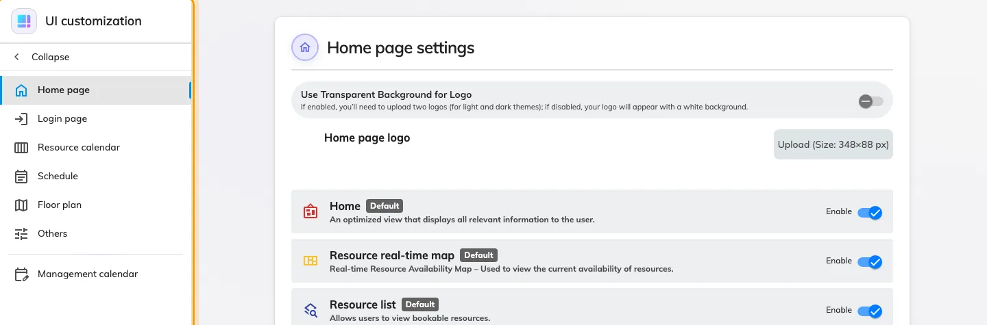
- Home page — the logo people meet after signing in, how much of their own home screen they may rearrange, and whether it carries the floor plan at all.
- Login page — the logo before they sign in, whether the password form is offered at all, and a block of instruction text.
- Resource calendar — the shape of the booking grid in the user portal, and what a booking card carries.
- Schedule — which room-releasing options the booking sticker offers.
- User booking form — how much of a room’s own description the person booking it reads.
- Floor plan — which labels a map shows before anyone touches a filter.
- Others — the settings that shape the product but belong to no one screen.
Below the divider sits Management calendar, and the divider is the point: everything above it restyles a surface an end user sees, while that one restyles the console you are standing in. Same module, different audience.
What each page is for
| Page | Changes | Who notices |
|---|---|---|
| Home page | Home logo (light, dark), three switches for what users may do to their own layouts, and whether the floor plan appears beside the timeline | Everyone, after sign-in |
| Login page | Login logo (light, dark), hiding local sign-in, instruction text | Everyone, before sign-in |
| Resource calendar | Column width, row height, booking-card colour and fields, per-purpose card overrides | Anyone booking from the portal |
| Schedule | The sticker’s Convert to online meeting and Cancel room booking only | Anyone cancelling a booking |
| User booking form | Whether a resource’s description prints under the picker, quietly or as a caution, and whether a booking may be a series | Anyone booking from the portal |
| Floor plan | Default label mode per resource kind | Anyone opening a map |
| Others | Default resource order, booking-form auto-complete languages | Anyone booking |
| Management calendar | Column width, row height, block colour and fields, the console’s own cancel option, and its booking form’s resource description and series cap | Administrators |
Two things it does not do
- It does not decide what exists. Adding a booking purpose, a resource or a custom field happens in that module; UI customization only decides how the thing already there is drawn. A purpose with no override simply uses the default card.
- It does not override a person’s own choice. Light or dark theme, language and time format remain the reader’s — see Change your language, theme and time format. Supplying both a light and a dark logo is how you follow that choice rather than fight it.