

Event pass reference
Set up the mobile event pass — every field on the mobile pass page, what it changes, and which of them Google ignores.
The company-wide design every event pass starts from. An event can override the three colours; nothing else here is overridable.
Open Mobile passCustomization
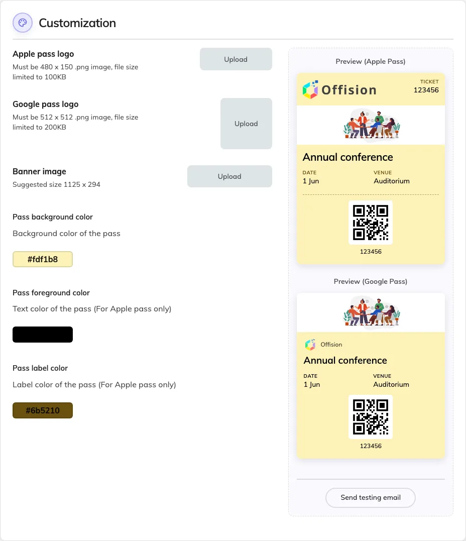
The company pass design, with both previews beside it.
| Field | What it does | When to change it |
|---|---|---|
| Apple pass logo | The mark at the top of an Apple pass. A .png, 480 × 150, under 100 KB | Whenever your brand changes. A wide lockup suits this shape; a square logo will sit small in it |
| Google pass logo | The mark on a Google pass. A .png, 512 × 512, under 200 KB | Same, but supply a square version — Google will not use the wide one well |
| Banner image | The strip across the pass, around 1125 × 294 | Set it once as a company fallback. Most events cover it with their own poster |
| Pass background color | The colour of the card | To match your brand. Check both previews — this is the only colour Google follows |
| Pass foreground color | The pass’s text colour. Apple only | Whenever the background is dark enough that default text stops being readable |
| Pass label color | The small caption above each value. Apple only | To soften the captions against the values. Leave it if you are unsure |
Preview (Apple Pass) and Preview (Google Pass) show the result on sample data — Annual conference, Auditorium. Judge every colour on both, because two of the three do nothing on one of them.
Send testing email posts a pass to yourself, which is the only way to see the real thing on a real phone before an event depends on it. The previews are drawings; the phone is the test.
What this page does not control
- What is written on the pass. The event’s name, times and venue come from the event; the QR code comes from the participant’s registration.
- The image most passes actually show. An event with a poster uses that, above the banner set here.
- Whether a pass installs. That is the phone’s decision — see a pass won’t install, or looks wrong.