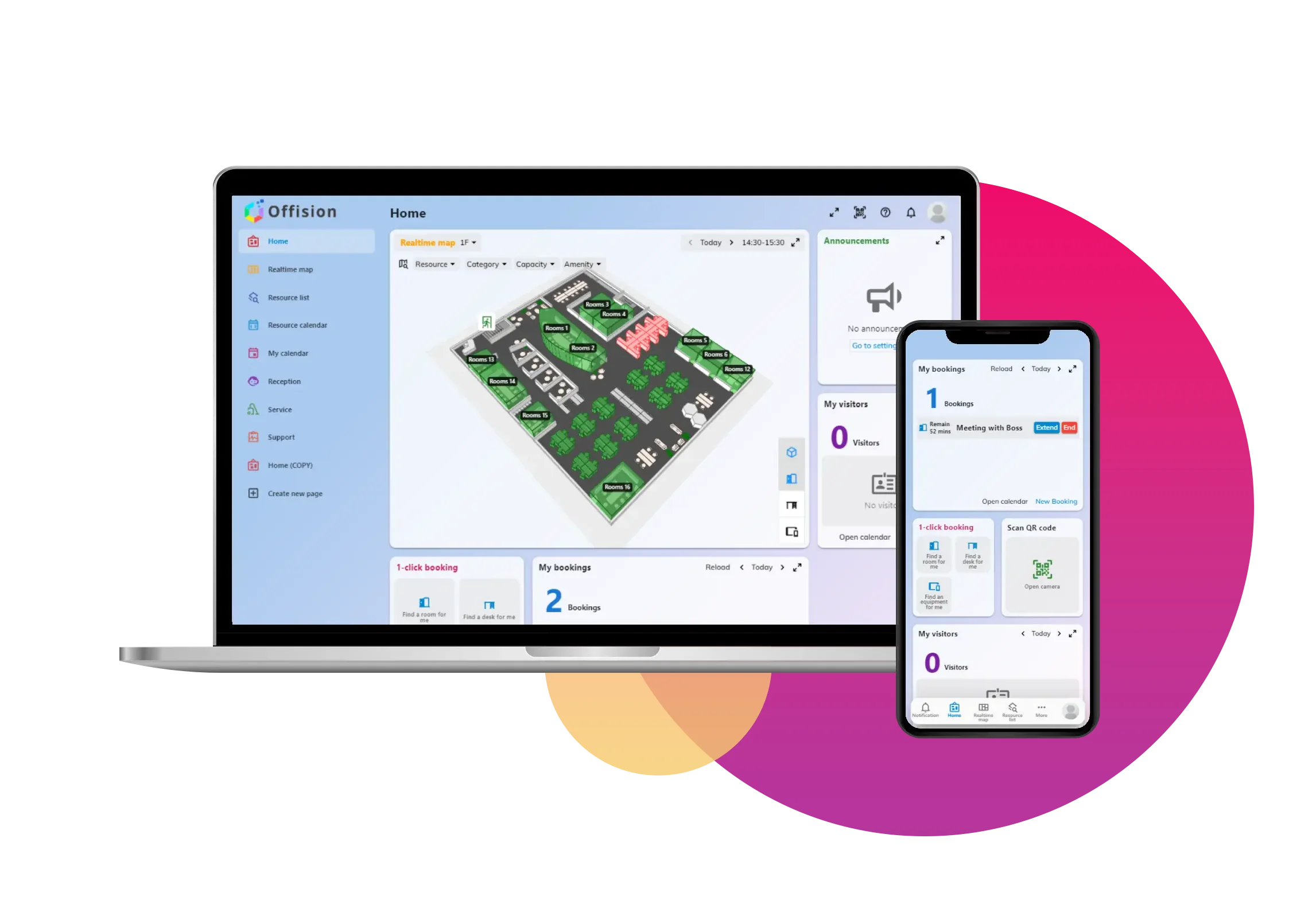
A timeline chart displaying booking analytics, showcasing room or desk bookings over time with key metrics such as usage trends, peak hours, and occupancy rates.
洞察與最佳實踐,協助您優化工作空間
Purpose:
The timeline chart is designed for workspace managers, administrators, or decision-makers to gain actionable insights into room or desk bookings over time. It helps in identifying trends, optimizing resource allocation, and improving workspace utilization.
Example Use Cases:
Peak Usage Analysis:
A company reviews the timeline chart to identify peak booking hours and adjust cleaning schedules or staffing to better match usage patterns.
Resource Optimization:
A facilities manager uses the chart to spot underutilized rooms or desks and repurpose them to meet the demand for more popular time slots.
Policy Improvement:
By analyzing trends, an organization implements booking policies, such as limiting advanced reservations, to prevent overbooking during high-demand periods.
Cost Efficiency:
The timeline chart is used to determine if specific spaces are consistently underutilized, helping justify changes like downsizing unused areas or reconfiguring layouts.
Employee Productivity Insights:
The HR team correlates booking trends with employee productivity to ensure adequate space is available during high-collaboration periods.
Real-time Booking Adjustments:
During an event or peak season, administrators monitor the chart in real-time to make quick decisions about reallocation or opening additional resources.
This tool is ideal for organizations aiming to make data-driven decisions to maximize workspace efficiency and enhance user experience.
備受全球機構信賴
加入數百間使用 Offision 提升工作空間管理效率的企業
©2026 ONES Software Ltd. All rights reserved.