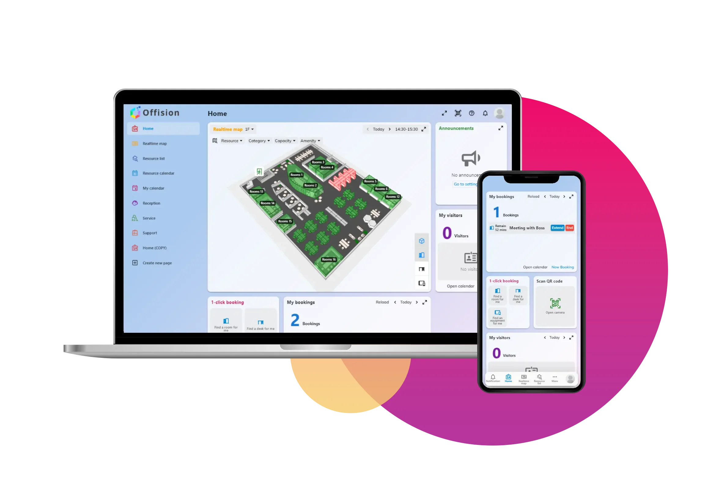
See how the office is really used.

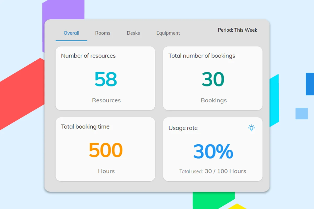
Booking logs are not a plan. Offision Analytics turns reservations and occupancy into heatmaps, utilization rates, snapshot maps and exports — one dashboard for facilities, workplace and leadership.

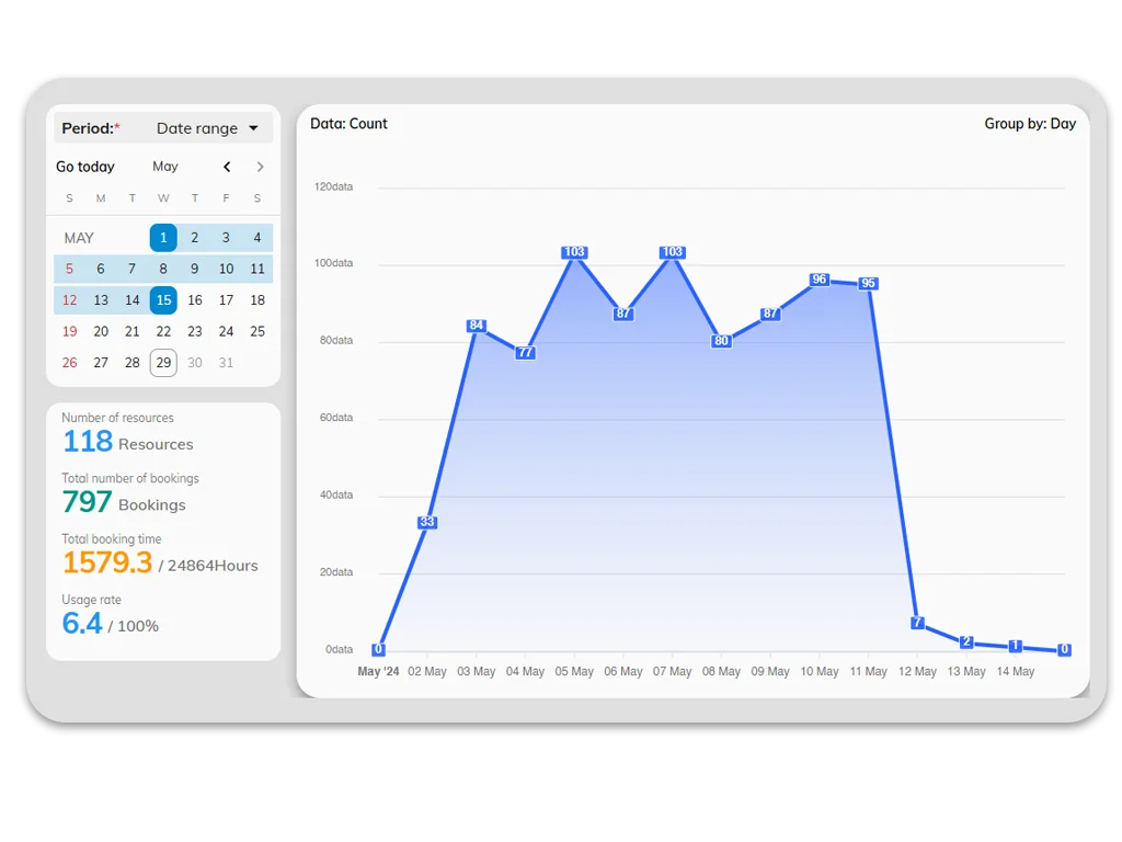
Workplace analytics dashboard showing room utilization charts and heatmaps

Workplace analytics

Evidence, not guesswork

Definition

What is office usage reporting software?

Office usage reporting software (also called workplace analytics) measures how rooms, desks, and other spaces are used over time—so facilities and workplace teams can right-size real estate, cut no-shows, and plan hybrid schedules with evidence. Offision Analytics turns booking and occupancy data into heatmaps, utilization rates, snapshot maps, and executive-ready exports in one dashboard.

Analytics chart comparing booked time to occupied time for meeting rooms
Utilization rate

Booking vs occupancy in one view

Ghost bookings inflate utilization on paper. Compare reservations to actual use so no-shows and dead slots show up before the next lease conversation.

  • Usage rate by room, floor and building
  • Timeline of bookings vs check-ins
  • Trend lines to track policy changes
Read: booked but not occupied
Executive analytics dashboard prepared for a workplace lease review
Executive exports

Numbers leadership can trust

Finance and workplace teams should not rebuild spreadsheets from raw booking logs. Export utilization, peaks and underused zones in formats ready for the board pack.

  • CSV exports for finance and CRE
  • Executive charts without digging in admin
  • Compare sites and floors side by side
Read: no numbers for the lease review
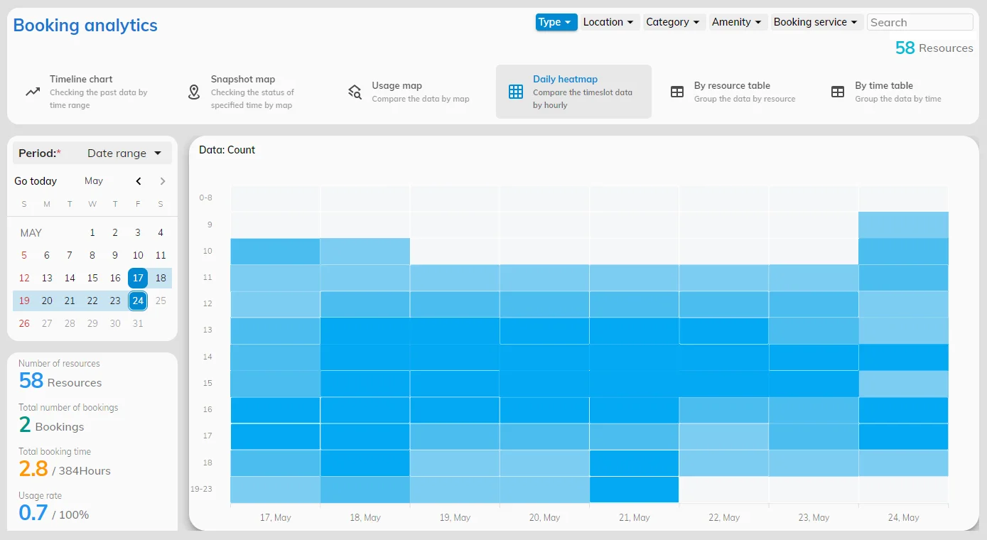
Daily heatmap showing hourly booking intensity across meeting rooms
Daily heatmap

Peak hours by room and zone

Cleaning, catering and hybrid policies need hourly demand — not a gut feel. Daily heatmaps show when each resource is actually busy.

  • Hour-by-hour comparison across resources
  • Spot quiet mornings and crowded afternoons
  • Plan staffing around real peaks
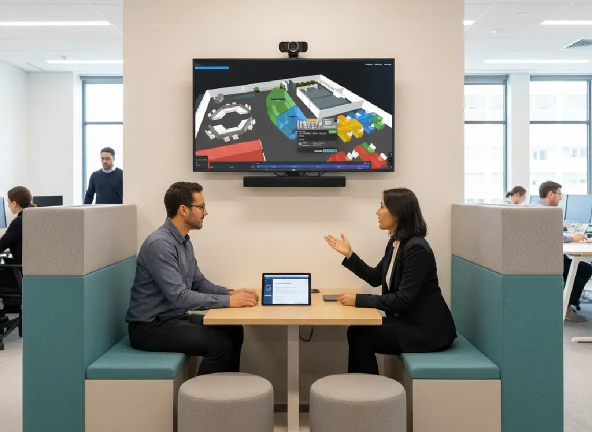
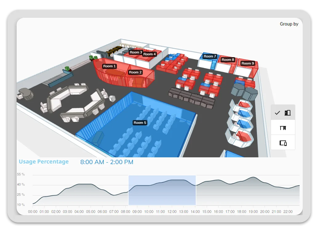
3D floor snapshot map with room utilization at a selected time
Snapshot map

One picture of the whole floor

Spreadsheets cannot show which desks are live right now. Snapshot maps place utilization on the floor plan at the moment you choose.

  • Point-in-time view on the 3D map
  • Floor-by-floor comparison
  • Share a visual with site teams
Space utilization breakdown by floor and resource type
Space utilization

Right-size with segmented data

Averages hide empty wings and overcrowded floors. Break utilization down by type, floor and time band before you add or surrender space.

  • Desks, rooms and zones by category
  • Occupancy segmented by floor and time
  • Track changes after layout moves
Usage pattern chart showing weekly office attendance rhythms
Usage patterns

Patterns people actually follow

Attendance policies fail when they ignore how teams really show up. Spot weekday rhythms, team clusters and quiet days before you reset the desk policy.

  • Trend detection across weeks and months
  • Compare teams, floors and sites
  • Feed findings back into desk and room policy
Planning lenses

Welcome to the data-driven workplace

Ensure you have all the necessary information to make wiser decisions about your office space, leading to improved business outcomes.

Provide the right resources

Provide the right resources

Determine which desks and rooms see the highest utilization, so you can equip and configure those spaces accordingly.

Customize office reports

Customize office reports

Customize your dashboard with different criteria that help you to assess workplace experiences and adapt as needed.

Track improvements

Track improvements

Track the impact of your workplace enhancements over time to better understand how they affect your business.

In the dashboard

Gather executive insights

Improve collaboration and productivity with data-driven recommendations based on your unique office usage

Space utilization insights

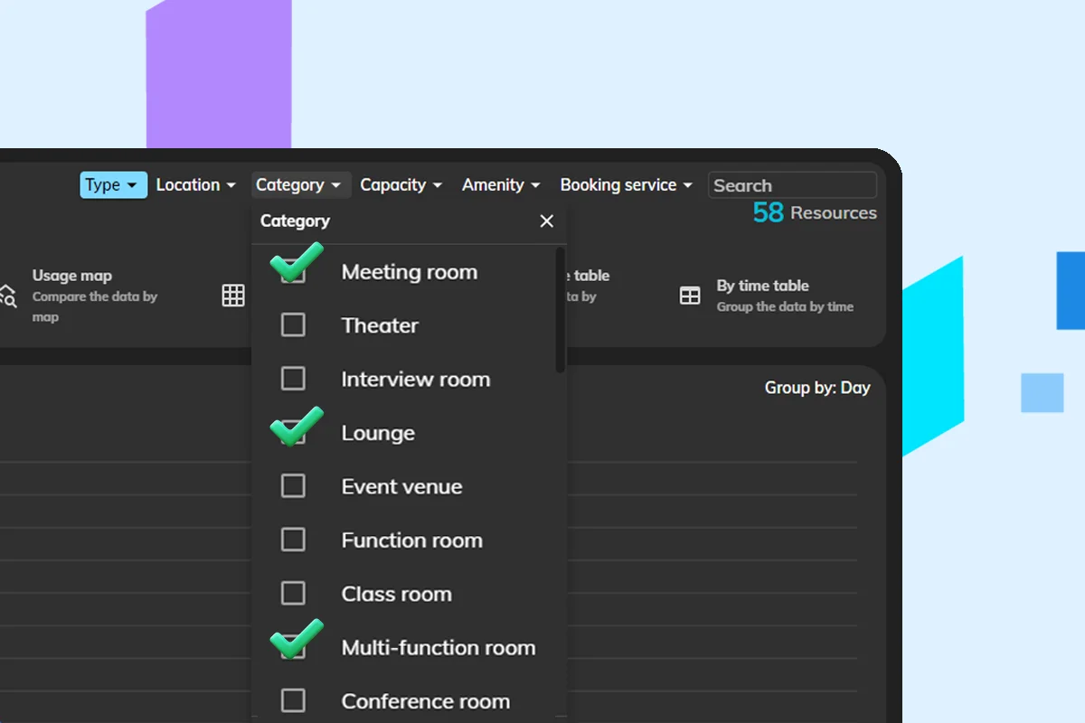
Analyze desks, rooms, and occupancy data segmented by type, floor, time, etc.

Data exports

Export your workplace analytics data as CSV file for reporting.

Timeline chart

Track the usage data like percentage, minutes, number of bookings etc.

Snapshot map

Easily check the usage data of specified time on a 3D map.

Daily heatmap

Compare the timeslot data of different resources hourly.

Usage rate

The effectiveness of your office resource. Use insights to refine your office

See how booking data feeds analytics

FAQ

Office usage reporting FAQs

Straight answers about workplace analytics, utilization, and how Offision reports space usage.

Office usage reporting tracks how often rooms, desks, and other workplace resources are booked and occupied. It shows utilization trends, peak hours, and underused spaces so you can make data-driven layout and policy decisions.

Offision combines booking data with live workspace activity to calculate usage rates, heatmaps, and floor-by-floor snapshots. You can compare buildings, floors, and resource types over time.

Yes. Daily heatmaps highlight peak hours and busy zones so you can plan cleaning, catering, and hybrid attendance policies around real demand.

Yes. Offision supports data exports and executive-friendly charts—timeline views, utilization insights, and snapshot maps—so leadership can review space performance without digging into raw logs.

Yes. Analytics is built on the same Offision platform as room booking, desk booking, parking, and floor plans, so reports reflect the spaces people actually reserve and use.

Ready to answer with data?

Start with the question you cannot answer today — Offision turns bookings and occupancy into reports you can act on.

Get Started Free