

Put content on a board
Which widget can sit where, how the main stage plays one thing or many, and what makes a board interrupt itself when a visitor arrives.
Everything on a board is opened by clicking it in the preview. There is no list of widgets to work through and no properties panel to hunt in: click the thing you want to change, and the rail on the right becomes its settings.
Open SignageA board has five kinds of place
What you are offered when you click depends entirely on where you clicked, because a tall column and a small square tile cannot hold the same things.
| Place | Shape | What it is for |
|---|---|---|
| Main stage | The large flexible area | The one thing the screen is really showing |
| Side widgets | A tall column beside the stage | A list that runs down the screen — bookings, visitors, announcements |
| Info cards | Fixed 16:9 | A glanceable readout — a clock, the weather, a summary |
| Action buttons | Fixed 3:4 tiles | One thing to press, or one code to scan |
| Text bar | A thin band on an edge | Text scrolling past |
Which of these your board actually has is a layout question, not a content one — see Change a board’s layout.
What can go where
Bookings & events
| Widget | Can go on |
|---|---|
| Booking list | Main stage · Side widgets · Info cards |
| Resource calendar | Main stage |
| Booking status - Map | Main stage |
| Resource list - for booking | Main stage |
| Event list | Main stage · Side widgets |
| Event information | Main stage |
| Booking status - Summary | Info cards |
Workplace data
| Widget | Can go on |
|---|---|
| Support ticket list | Main stage · Side widgets · Action buttons |
| Service request list | Main stage · Side widgets · Action buttons |
| Occupancy sensor data - Map | Main stage |
| Wayfinding QR code | Action buttons |
Ambient & info
| Widget | Can go on |
|---|---|
| Announcements | Main stage · Side widgets · Info cards · Text bar |
| World clocks | Main stage · Side widgets · Info cards |
| Clock | Info cards · Action buttons |
| Weather | Info cards · Action buttons |
| Hong Kong weather | Info cards · Action buttons |
| Lunar calendar | Info cards |
| QR Code | Action buttons |
| RSS Text | Text bar |
Visitor
| Widget | Can go on |
|---|---|
| Visitor welcome | Main stage |
| Visitor list | Main stage · Side widgets |
| Visitor self service buttons | Main stage · Action buttons |
| Visitor registration QR code | Action buttons |
| Wi-Fi QR Code | Action buttons |
Intercom
| Widget | Can go on |
|---|---|
| Offision call people list | Main stage · Side widgets · Info cards · Action buttons |
| Teams phone call people list | Main stage · Side widgets · Info cards · Action buttons |
Controls
| Widget | Can go on |
|---|---|
| Room control QR code | Action buttons |
| Open door button | Action buttons |
| Language selection | Action buttons |
Media
| Widget | Can go on |
|---|---|
| Image | Main stage · Info cards · Action buttons |
| Video | Main stage · Info cards |
| YouTube | Main stage · Info cards |
| Playlist | Main stage · Info cards |
| HLS (HTTP live streaming) | Main stage · Info cards |
| Website - iFrame | Main stage · Info cards |
| PDF Playback | Main stage |
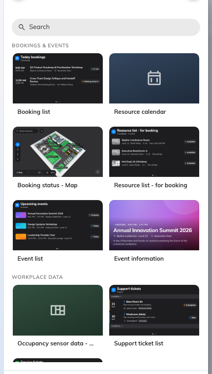
The picker, grouped exactly as the table above — and showing only what fits where you clicked.
The main stage plays in one of three ways
Click the stage and the first thing in the rail is Content mode.
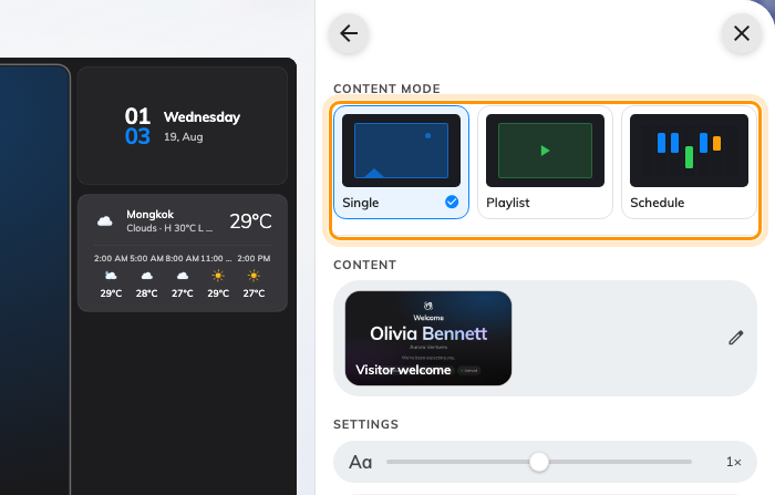
Single, Playlist and Schedule — the three ways a stage can behave.
Single is one widget, all the time. There is no scene list and no timer: the widget’s own settings are edited on this page, and the content row at the top is also how you change it for another.
Playlist rotates. Each entry is a scene, scenes are dragged into order, and each has a Duration in seconds — leave it blank and it uses the board’s default of 20. The eye on a row turns a scene off without deleting it, which is how you park a seasonal notice rather than rebuilding it next year. A video or a slideshow does not get cut off mid-play: playback widgets move the playlist on when they finish.
Schedule runs a week. Instead of a rotation you drag blocks onto a weekly grid and each block names the widget to show in that period — a canteen menu at midday, a welcome screen in the morning, something else on Saturdays.
Switching between the three throws nothing away. A playlist sleeps while the stage is in Single mode and comes back exactly as it was, and so does a schedule.
Takeovers: when the board interrupts itself
A takeover is not another scene. It replaces whatever the stage is playing for as long as it has something to say, and then hands back.
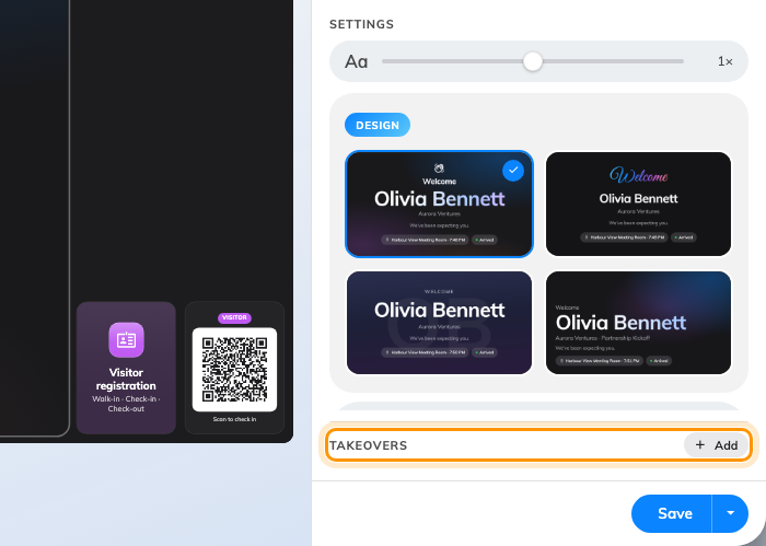
The takeover section: only what is already on is listed, and Add turns another one on.
There are three, and where two are due at once the one higher in this list wins:
| Takeover | Fires when | Default |
|---|---|---|
| Visitor welcome | Somebody checks in, or is expected | — |
| Event starting soon | An event is about to begin | 15 minutes before |
| Booking starting soon | A booking is about to begin | 5 minutes before |
The middle two are named the other way round from what most people expect: Event is an event from the Activity module, Booking is a room booking.
The list shows only the takeovers that are on — being listed is being enabled. The Add pill on the heading turns another one on and opens it; Remove at the foot of a takeover’s page turns it off and keeps its settings for later. There is no on/off switch beyond that.
Two settings on Visitor welcome decide almost everything about how a reception screen behaves. Show chooses between guests who have checked in and guests who are expected around their appointment time — a screen behind the desk usually wants the first, a screen at the door the second. Greet chooses between every check-in across the buildings this screen belongs to, and only the guests who scanned this screen’s own QR code.
Settings that apply to the whole board
The rail’s first page — the one it opens on, and the one the ← arrow always returns to — is the board itself rather than anything on it.
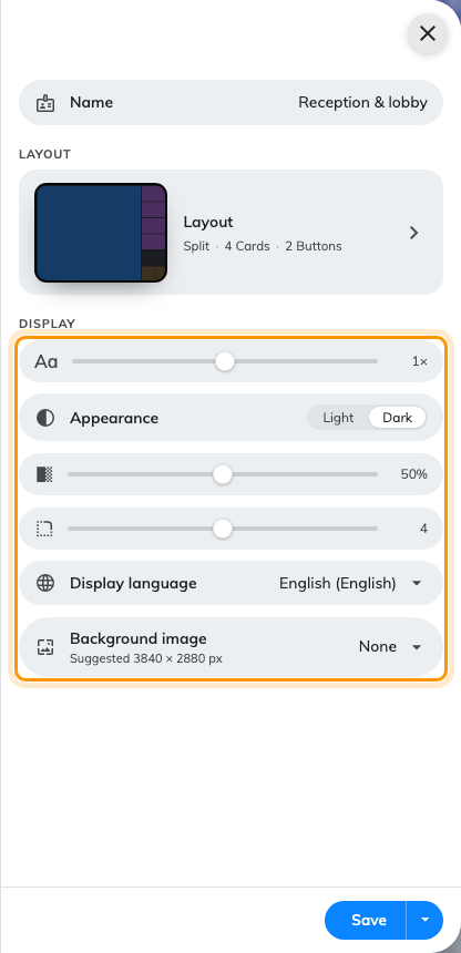
Everything here applies to every widget at once.
| Setting | What it does | When to change it |
|---|---|---|
| Name | What the board is called in the list and in the device wizard | Immediately — a new board is named after the purpose it was created from, which stops being distinctive by the third one |
| Font size | Scales all the text on the board at once, from half size to two and a half times | The screen is further away, or closer, than its size class assumes. Media widgets ignore it — nothing in a video responds to a type ramp |
| Appearance | Light or dark | A bright lobby, or a screen that has to match the wall it is on |
| Widget background | How solid the panels behind widgets are, from fully transparent to solid | A background image is showing through too strongly, or not enough. The two map widgets ignore it |
| Corner radius | How rounded the panels are, square through to fully rounded | Matching the hardware’s own bezel |
| Display language | The language the board renders in | The screen serves a different audience from the console’s own language |
| Background image | An image behind everything | Branding a lobby screen. Use the suggested pixel size, or it will be scaled |
Two of those rows carry only an icon and their value — the fill slider directly under Appearance is the widget background, and the one below it is the corner radius. Everything else on the page is named.
Any single widget can override the font size on top of this, on its own settings page — useful where one card holds a long list and everything else is a headline.
What this does not control
- Which places exist at all. How many cards, whether there is a side column, which edge it sits on — all of that is the layout, in Change a board’s layout.
- What a widget actually shows. A booking list shows the bookings that exist; a visitor list shows the visits that were invited. The board reports, it never decides.
- Where the board thinks it is. Widgets that need a place read the device’s location, not the board’s — see Build a signage board and put it on a screen.